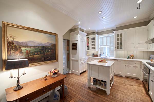
Walk into this former carriage house, take a few steps and you’re in the kitchen. The visual impact was one of the motivating factors that prompted the homeowner to completely remodel it.
In the ‘80s and early ‘90s, living large defined home design. Cavernous great rooms, ballroom-size kitchens and bathrooms that rivaled the size of Roman spas were high on must-have lists. Over that period, the average home grew from 1,780 square feet to 2,400 square feet.Now, of course, many of the original owners of homes built during that period are either downsizing or are moving to 55+ or retirement communities. As a result, ‘80s-era homes are hitting the market and a new generation of buyers is looking to designers like Kevin Martin of Quality Custom Cabinetry and remodelers such as Bruce Gingrich of Glenn Gingrich, Inc., to make living spaces seem less overwhelming.
As per the adage, “what goes around comes around,” today’s home buyers – specifically the millennials – are looking to live in smaller, more manageable houses. If you’re a devotee of HGTV, DIY, FYI and other home-focused cable networks, you’re probably aware that “tiny” and “flipping” have become the driving forces behind many of their shows.
In Lancaster city, small house living is not a new phenomenon, as is evidenced by streets filled with tidy row homes. Repurposing carriage houses and other utilitarian buildings to create unique living spaces has also long been popular in the Red Rose city.
Fifteen years ago, a newcomer to Lancaster had taken up temporary residence with friends while he searched for a home to buy. One day he took a walk through one of the city’s historic neighborhoods and noticed a small “house” that sat off the street. “I thought to myself, ‘I love that!’” he recalls. A few weeks later he walked the same route and to his surprise, a For Sale sign had been posted on the property. He immediately arranged for a showing. Taking a step into the foyer, he made an instantaneous offer to buy the house.
It seems he purchased a slice of Lancaster’s architectural history that relates to the Victorian era: Built in the late 1800s, it originally served as the carriage house for a nearby residence. The caretaker lived in an apartment on the upper floor. In the 20th century, it was transformed into a private, single-family, 4-bedroom home.
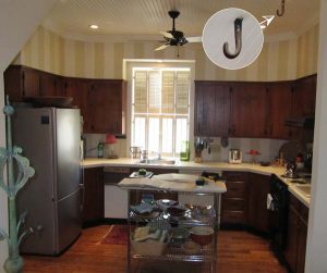
The carriage house’s new owner moved in and quickly realized he had a lot of work ahead of him. While the original brown beadboard ceiling was beautiful, it delivered the impression of a ‘50s-era bowling alley. Yet, he liked how it related to the era in which the house was built and vowed to keep it and find a way to make it less obvious. The knotty-pine kitchen, circa the ‘60s, was certainly vintage, but it had to go. “Oh, and there was Laura Ashley wallpaper everywhere,” he notes. And, it didn’t want to budge from the horsehair plaster.
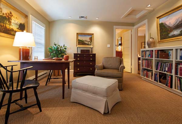
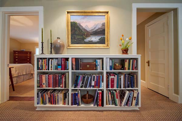
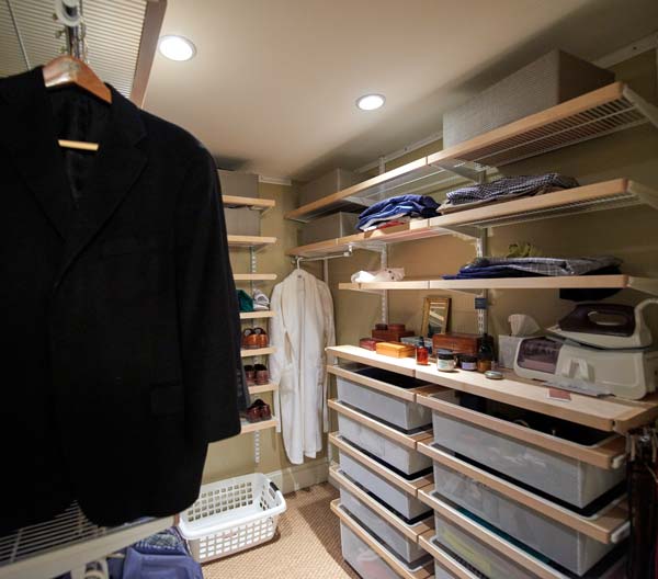
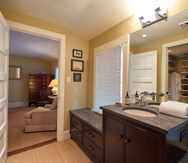
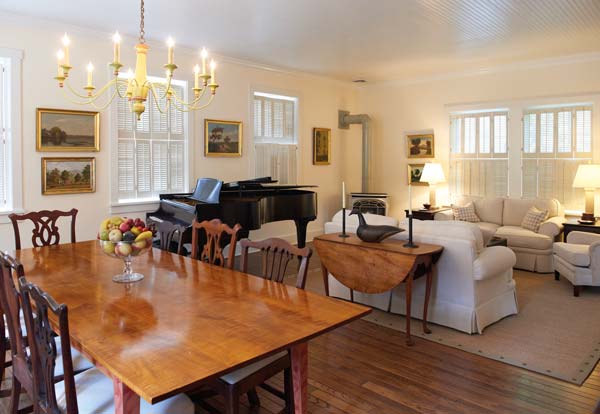
Still, the new homeowner forged on. He worked with a remodeling contractor to transform the second floor. A hallway was eliminated, which allowed for one of the bedrooms to become a loft-like sitting room and library. The bedroom that sat between the master bedroom and bath was reconfigured to become a dressing area and walk-in closet, thus creating a full-fledged master suite. Downstairs, the living/dining room was refurbished and given a fresh coat of paint, which softened the impact of the beadboard ceiling.
After a 12-year wait, it came time to tackle the kitchen. Despite its minuscule size – 8×12 feet – the homeowner was at a loss from a design perspective. “Everyone kept saying I had to take a wall down and open it up, but I didn’t want to do that,” he explains. He turned to Horizon Kitchens for help and began working with Kevin Martin. “He was convinced it was a design nightmare,” Kevin recalls.
The first time Kevin saw it, he had to agree with the nightmare assessment. “I didn’t know what to make of the hook in the ceiling, but it became a quirk that I grew to like,” he comments. “We agreed it had to stay.”
Because he wanted to devote the bulk of his time to designing the space, Kevin suggested they add Bruce Gingrich of Glenn Gingrich, Inc., to the team as a design associate and remodeler. “Bruce could not only serve as the remodeling contractor, but I was confident that because of his design aesthetic, he could essentially be the associate designer for the project and help with selecting countertops, the backsplash, faucets and lighting,” Kevin explains. “It was also nice to have him onboard to bounce ideas off of and offer second opinions.”
In Bruce’s opinion, “It was critical that it look good,” he says of the kitchen. “You walk through the front door and you’re there. I also thought that it was important for the design to reflect the character of the house.”
He was also aware of the challenges the small space presented. “The challenge here was to make things work when you’re faced with tight and compromising conditions. But, that’s part of the fun of a remodeling project: Sometimes you can be more creative than if you’re working with a clean slate.”
Bruce also had another ace up his sleeve: He loves to cook and fully understands the dynamics of a kitchen.
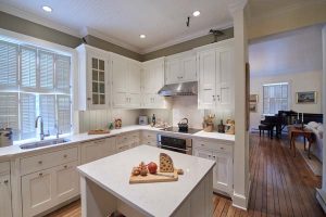
Kevin began by taking cues from other areas of the first floor. “The kitchen is open to all areas, so it needed to complement the styling and decor that was already in place,” he explains. To achieve that, he employed a simple inset-door style. Furniture-style construction also distinguishes the cabinetry. The cream paint color echoes the wall color and upholstery in the living/dining room.
Convenience was also built into the design, as all the lower cabinets are fully outfitted with pull-out shelving.
Eliminating clutter and creating a seamless look are keys to designing a small kitchen. Here, cabinet panels on the refrigerator and dishwasher help to achieve that, as does the elimination of outlets and such. Instead, outlet strips are tucked out-of-sight beneath the cabinets.
Light is another element of making small spaces appear larger. In addition to the cream-based color scheme, an expanse of recessed lights illuminates the kitchen. Natural light streams in through the off-center window.
The sensation of additional light comes courtesy of a door that separates the utility room/laundry from a hallway that also provides access to a bathroom and pantry. The homeowner liked to keep the door open, but complained that it resulted in a drafty kitchen. “We looked into a glass door but didn’t find anything that was right,” Bruce explains.
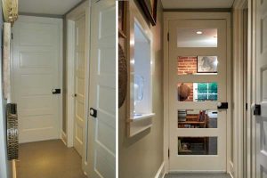 Then, one day Bruce was struck by the idea of removing the recessed panels of the existing door and replacing them with glass. The old/new door proved to be a perfect solution as it admits natural light but blocks drafts.
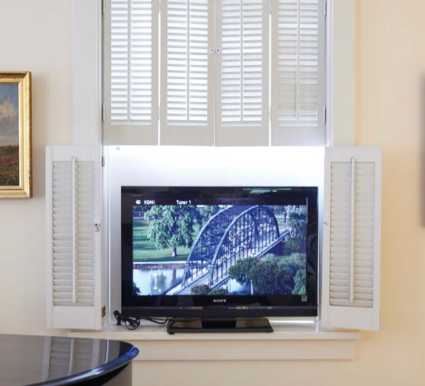
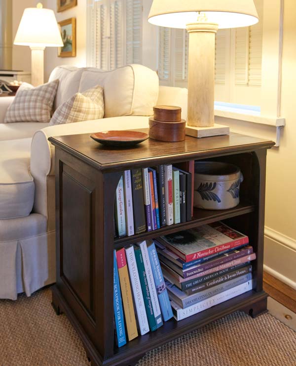
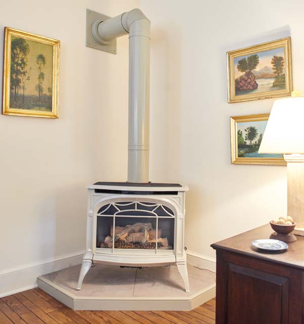
Bruce and the homeowner have continued to collaborate on projects. The area that holds the gas stove in the living room was made less obtrusive, and Bruce designed end tables that would contain the boxes, wires, etc., for the television, as well as provide display areas for books.
The homeowner, who has lived in Boston, Baltimore and Washington, loves living in Lancaster. “This is probably the best house I’ve ever had,” he says. “The tradespeople in Lancaster are wonderful, and they are so talented.”
While he is living small, he says the house is perfect for entertaining. “It’s a very easy house for entertaining,” he says. “The kitchen has made it more so. Now, there’s a nice flow that makes it very inviting. My friends from Baltimore and D.C. love it.”
CREDITS
Kitchen Design: Kevin Martin
Remodeler/Designer: Bruce Gingrich, Glenn Gingrich, Inc.
Cabinetry: Horizon Kitchens
Counters: Lapp Tops
Specialty Cabinets: Joel Bare




Leave a Reply