A new generation of interior designers is tweaking Lancaster’s penchant for traditional styling by adding a nod to modernism. Cecilia “Cece” Hurdleston is one such designer. She loves working with clients who entrust her to create home styles that mirror their personalities and interests. “Pushing boundaries is truly what turns a successful project into an exceptional one,” she philosophizes.
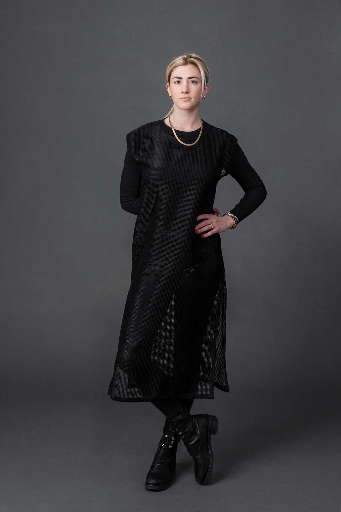
Cece Hurdleston earned her degree in interior design from West Virginia University. Her career has taken her from Lancaster to the San Francisco Bay Area, Philadelphia and back to Lancaster, where she has been on staff at INTERIORS Home for the last two years.
I discovered Cece through perusing the portfolios of area designers, including those at INTERIORS Home, where Cece is an interior designer. A project that had obviously been undertaken in a home dating to the late ’80s “spoke” to me. I had found this month’s home feature!
Actually, fate, kismet, the Lancaster connection … whatever you want to call it, also intervened. Not long after spying the project, Cece’s Instagram postings began to mysteriously appear on my feed. Then, I saw that Nick Gould had recently photographed Cece for her website and social media. Nick had become acquainted with Cece through patronizing George Zagas’ coffee shop, Aura Espresso Room, in Downtown Lancaster. George and Cece are engaged and will be getting married in the fall. I actually crossed paths with Cece when Jordan Bush and I were stationed outside the home of one of her clients in order to photograph an INTERIORS’ delivery team for the November issue of the magazine. I decided working with Cece was meant to be, so I emailed her.
Cece, who grew up in Manheim Township, recalls being infatuated with design from the time she was a child. “I was obsessed with rearranging the furniture in my bedroom,” she recalls. “I was constantly moving things around.” From her bedroom, she began “designing” other rooms in the Hurdlestons’ home.
She was also genetically predisposed to become a designer. Her father, Chris, owned Marbleon, a company that specialized in cast-polymer and cultured-marble products for the home. “I just loved looking at all the samples,” she says. Her mother, Phyllis, was formerly an account rep for Learning by Design, a trade publication that focuses on the design aspects of educational institutions. She’s been an account rep for the Lancaster-based publication, East Coast Equestrian, since 2014. “I grew up riding horses,” Cece notes.
After graduating from Manheim Township High School, Cece enrolled at West Virginia University, majoring in interior design. “I was fortunate to get into the program,” she notes. “They had 20 spots and 50 candidates.” At WVU, Cece learned the technical skills of interior design, including the computer programs that have replaced the pencils, rulers and graph paper that were once used to plot room layouts.
After graduation, Cece returned to Lancaster, where she went to work for the architectural firm, Reese, Lower, Patrick & Scott (RLPS). “I was pulling fabrics and other materials for commercial projects,” she explains. Feeling restless, she headed for Los Gatos in the San Francisco Bay Area, where she went to work for Restoration Hardware, which is headquartered in nearby Corte Madera. “I liked living there but I really missed my friends and family,” she explains.
Back in Lancaster, Cece jumped at the opportunity to work for AK Interiors and Steiner-Houck & Associates. “I really got a feel for residential design through those experiences,” she says.
Her next stop was Philadelphia, where Cece worked at SHOPHOUSE, a small, luxury-design firm whose clientele includes high-profile professionals. “That was definitely a learning experience,” she says. “In fact, it shaped who I am as a designer. The level of professionalism that was required was an education in itself. I learned the importance of delivering concierge-style service and became a very detail-oriented designer. The skills I learned from working in Philadelphia are forever ingrained.” A quick learner, Cece eventually earned the title and responsibilities of project manager.
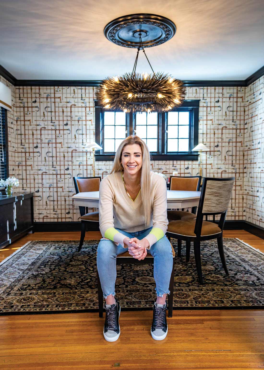
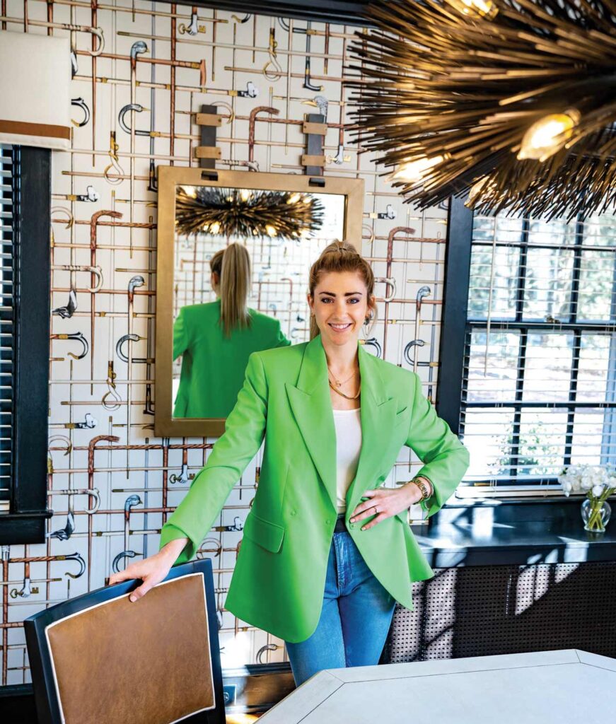
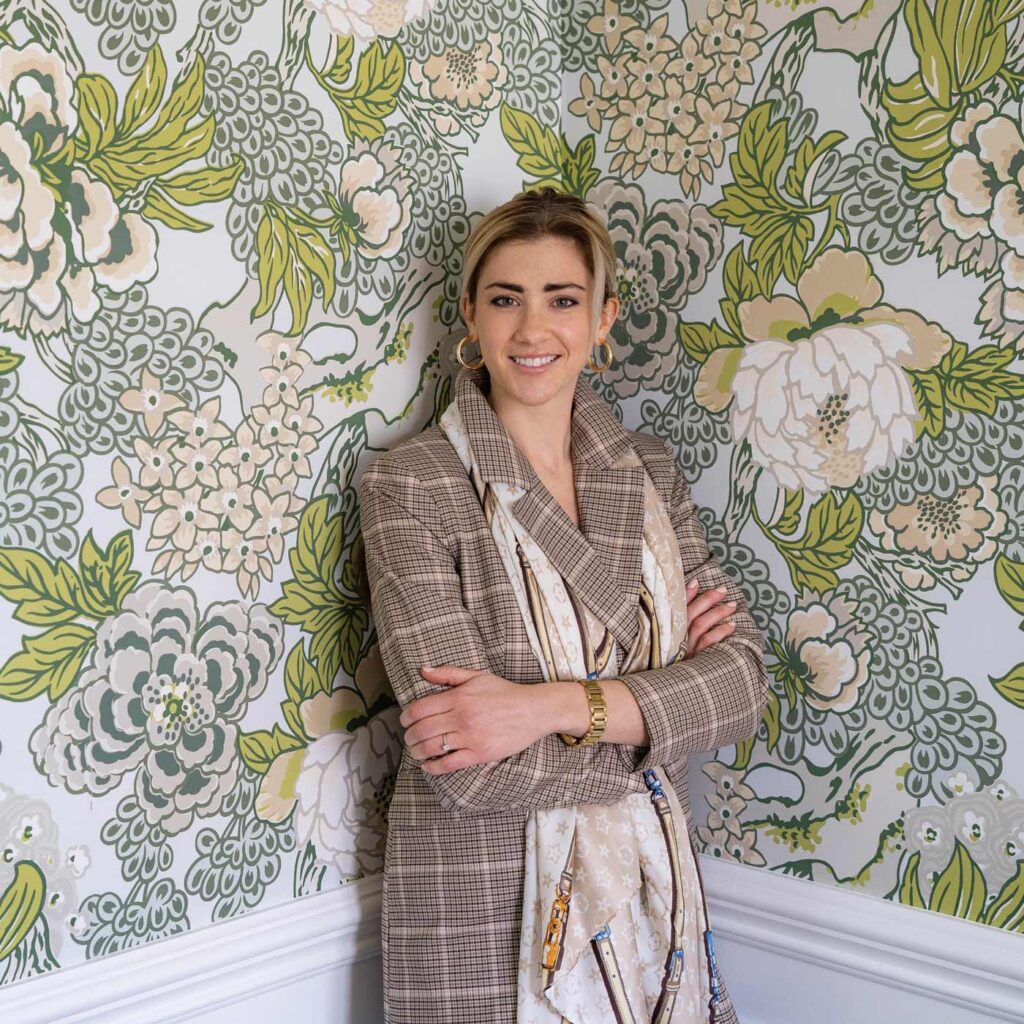
FROM THE COVER: Nick Gould photographed interior designer Cece Hurdleston at the home of one of her clients.
Two years ago, the lure of Lancaster again beckoned and Cece returned home. Working at INTERIORS also represents a professional homecoming of sorts. “I interned there when I was in college,” she explains. She’s enjoying the opportunity she has been given to work for a family-owned business. “It’s a wonderful working environment,” she says. “At INTERIORS, we have access to really amazing companies and products.” She also enjoys working in an area where creativity abounds and people take great pride in their homes. “People really love their homes in Lancaster,” she notes.
Thanks to her education and diverse experiences, Cece’s expertise extends to helping clients design their homes from top to bottom. While she has access to an incredible selection of products, Cece says the key to executing a successful design is “getting to know my clients and their personalities.”
As for style, Cece says Modern-Classic is her favorite look, as it isn’t definitive and allows for deviation. You could say that Cece “embodies” Modern-Classic, as she thinks nothing of accessorizing leather with pearls or pairing a cashmere sweater with distressed jeans and high-top sneakers. “I know Lancaster still has a reputation for being traditional but the beauty of Modern-Classic design is that you can go in a traditional direction but include some modern elements to provide an edge,” she explains. Of course, the opposite is also true – modernists can include some classic pieces to change things up. “Vintage can be edgy,” she points out. In her opinion, “Modern-Classic provides the best of both worlds.”
As with all of us, Cece likes to peruse social media and study what’s going on in the rest of the world from a design perspective. Who does she follow? “Who don’t I follow!” she remarks. She’s intrigued by the creativity and design work that are coming out of Texas. “There’s so much happening in Texas right now,” she says of the designers who are making the Lone Star State a design mecca. “And, Canada – there’s so much talent up there!” She pinpoints some favorite sites, naming Erica Gelman (Ontario, Canada), Caitlin Wilson (Texas), Ali Budd (Ontario, Canada) and Shea McGee (Utah, with a show on Netflix) as her current favorites.
As for her next goal, Cece would love to attend Furniture Market in High Point, North Carolina, in order to be among the first to see the designs and products that make their debuts each fall.
Follow Cece on Instagram @ceciliainteriordesign and view her portfolio at Interiorshome.com.
A sampling of her portfolio follows …
An All-Occasions Room
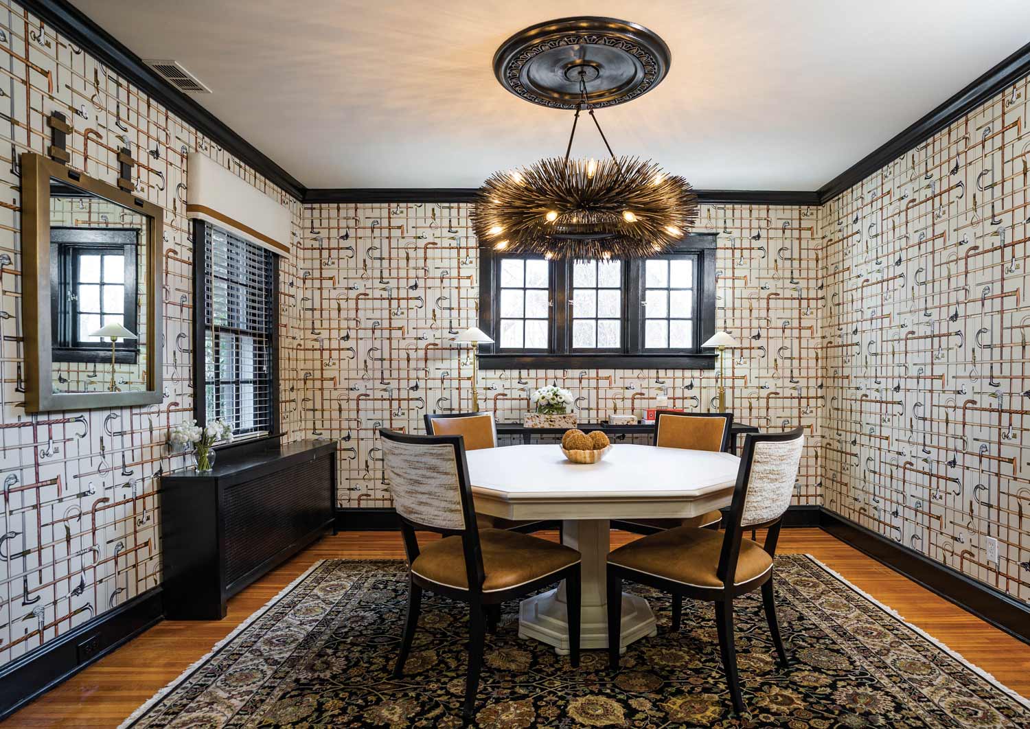
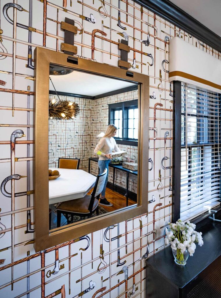
Before the re-do, the style of the dining room was very traditional thanks to the period furnishings, pineapple-embellished chandelier and Colonial color scheme. It was definitely reserved for special occasions. Now, its Modern-Classic vibe makes it a room for all occasions – holiday dinners, Friday night take-out, a game of cards or happy hour with the neighbors. The wallpaper evokes traditional styling due to the plaid effect it delivers. Its whimsical nature equates to modern styling. The black trim, molding and ceiling medallion provide “punch” to the room. Texture comes courtesy of the wool fabric on the backs of the chairs that in turn complements the wool cornice boards over the windows. Finally, the chandelier provides the wow factor. The rug is the only holdover from the previous décor.
A colleague at INTERIORS asked Cece to help her bring new life to her entryway and very traditional dining room. The client’s goal was to update the spaces but not to the extent that it would detract from the character of her circa-1930 brick Colonial home.
In the case of the dining room, Cece was aware her well-traveled client loved art and therefore felt she could “push” the aesthetics of the room, which had become one of those seldom-used, special-occasions-only spaces. It had also taken on office-oriented duties during the pandemic.
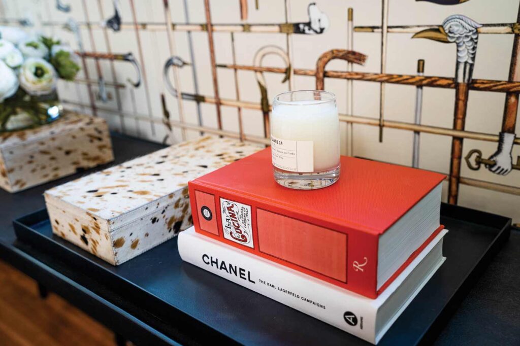
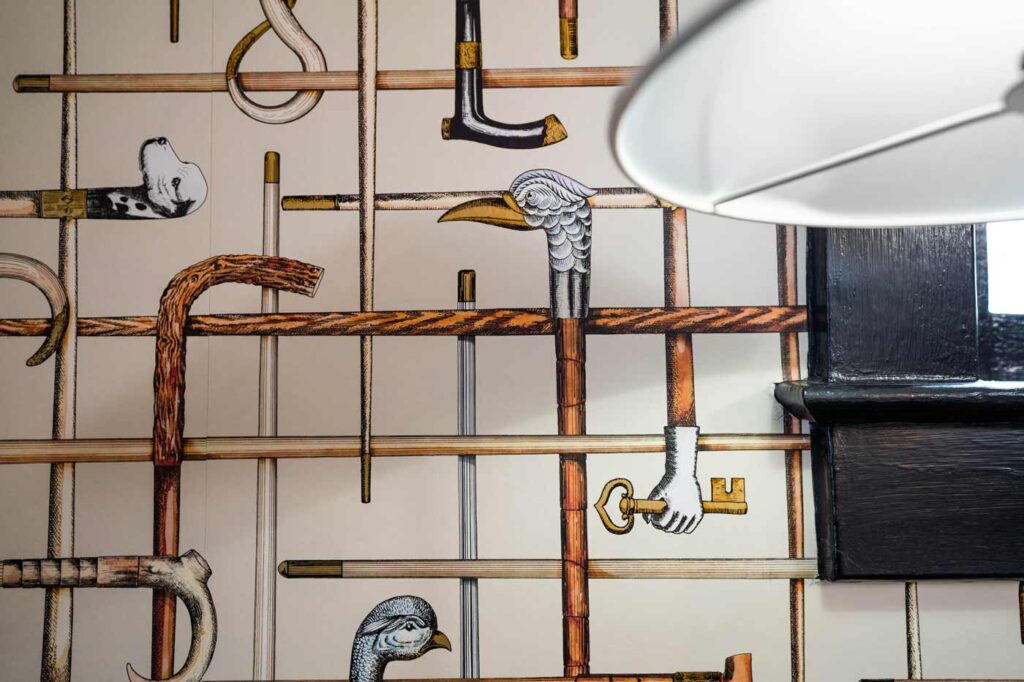
Cece chose to enliven the room with lighter-toned wallpaper. She chose a pattern called Bastoni from Cole & Son. Based on the design of a silk scarf from the 1940s, the pattern features antique walking sticks and canes, some of which are artistically embellished with carvings that take the shape of the heads of dogs and birds. The choice of paper proved to be a perfect fit, as her client is an animal lover. Gold elements in the paper add shimmer to the walls.
As I studied the wallpaper, I asked Cece what had drawn her to it, as I doubted I would have given it a second look. Her reasoning made perfect sense. “It provides the room with a tailored Ralph Lauren-like look, yet it’s whimsical and modern. The cane pattern is plaid-like, which takes it in a traditional direction.” Cece also points out that because the paper makes an artistic statement, hanging art on the walls is not necessary and, in fact, would only detract from the paper. Ditto for accessories; here, less is more.
As for the touch of modern, the moldings, trim, ceiling medallion and French doors were painted black, which according to Cece, makes the room “punchier.” The same philosophy applies to the black chandelier that appears to have been crafted from twigs.
A painted, vintage-inspired, octagonal-shaped table that is surrounded by upholstered chairs makes the room all the more inviting. “This room is now comfortable for all occasions,” Cece says. “It’s no longer reserved just for special occasions.”
2022 Style• Warm Neutrals
• Texture
• Wallpaper
• Texture
• Wallpaper
Credits
Chandelier: Arteriors
Chandelier Installer: Peter Argyropolous/Petros Electric
Buffet Lamps: Visual Comfort
Wallpaper: Cole & Son
Paint: Benjamin Moore
New Home/New Look
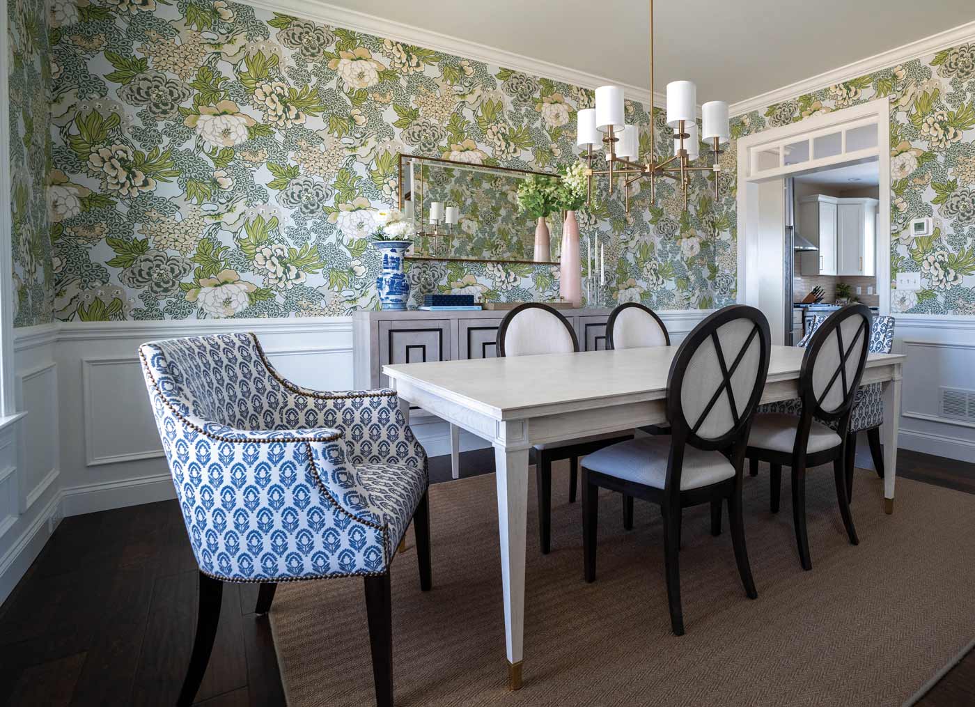
Cece maintains that the Modern-Classic styling of the dining room perfectly captures the homeowner’s vibrant personality.
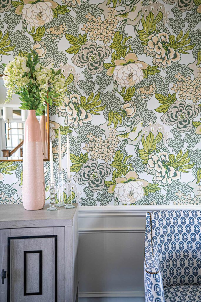
Upon meeting her new client, Cece felt her vibrant personality and very traditional decorating style didn’t mesh. Now that the client and her husband were moving to a newly built home, Cece was determined to unleash her client’s inner Modern-Classic style. “I feel this dining room really reflects the shift they’ve made,” Cece says of the bright and airy space.
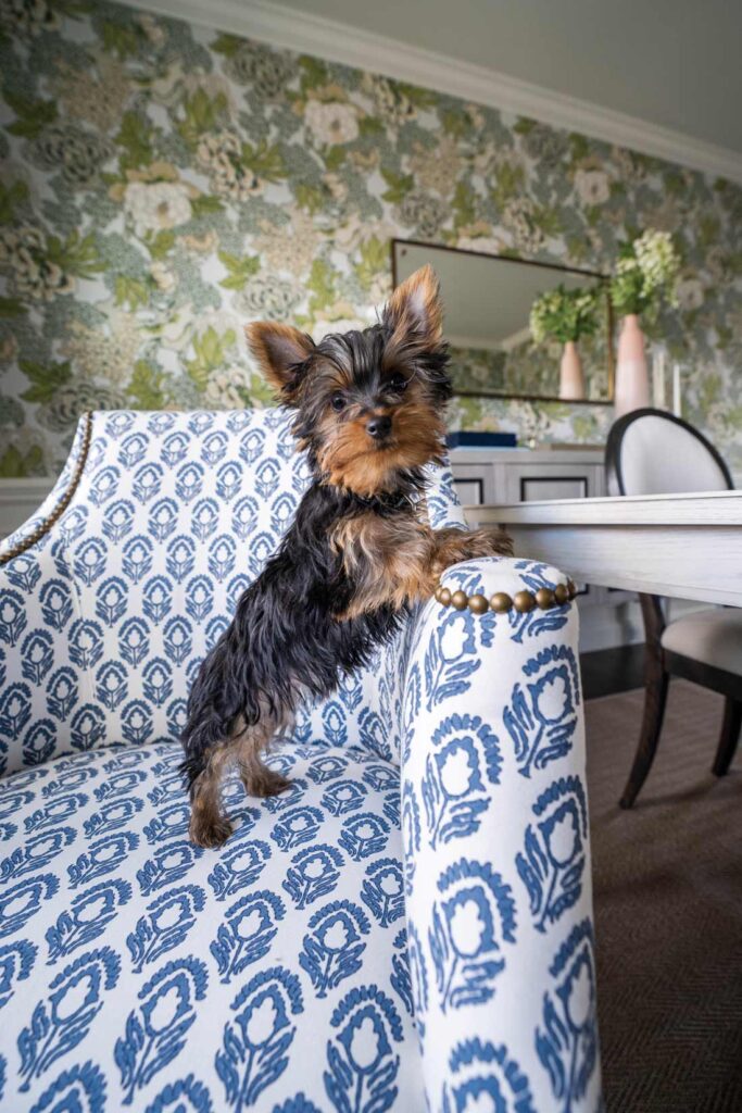
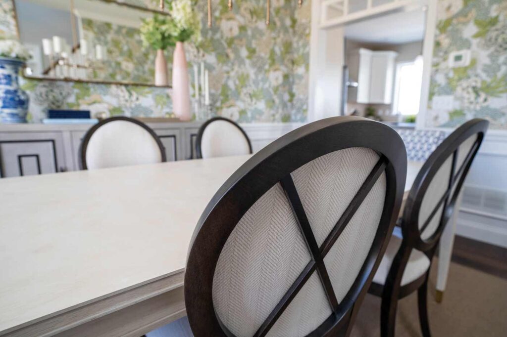
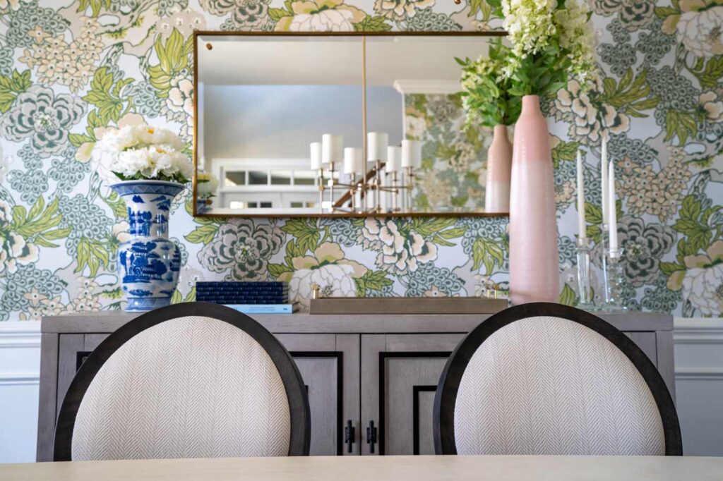
First, you’ll notice the statement floral wallpaper that pairs the “dynamic-duo” colors of 2022, pink and green. The paper also provides a perfect tie-in to the gray-toned walls that define the rest of the house. “I just think this wallpaper perfectly mirrors [my client’s] personality,” Cece says. “I think it will look stylish for years to come.”
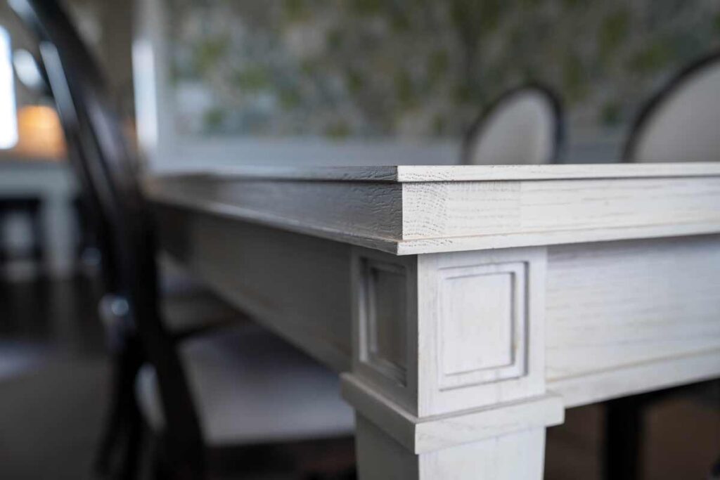
Other highlights in the room include a buffet whose embellishments mimic the design of the molding beneath the chair rail; a hardwood table with a painted finish and brass details that pay homage to traditional styling; and a mix of chairs, some of which speak to modern styling, while the chairs at each end of the table embody traditional thanks to nailhead trim and vintage-inspired fabric. The final element is a sisal carpet that pays homage to the past (18th century) but looks very modern in 2022.
• Earthy Hues of Pink
• Performance Fabric
Credits
Wallpaper: Thibaut
Dining Table: Century
Life’s a Beach
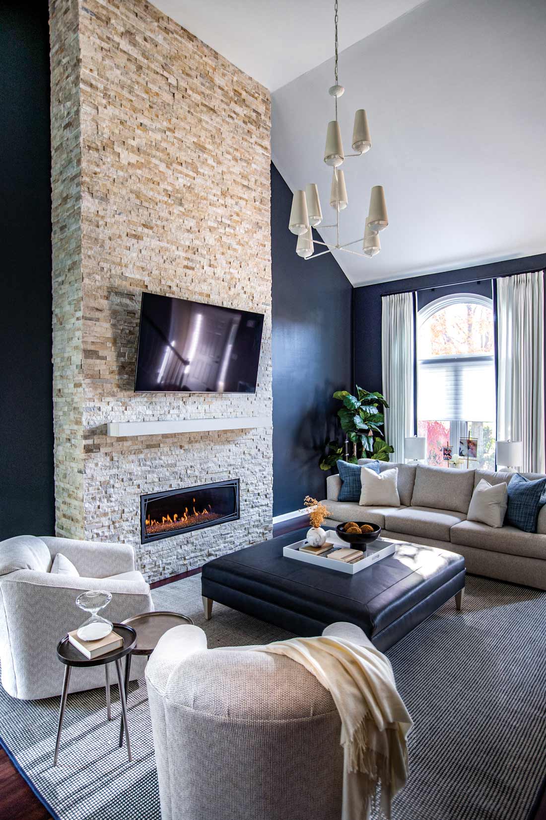
The beach-loving homeowner now enjoys a more subtle connection to her favorite getaway thanks to the Modern-Coastal styling that now defines her home.
You know how it goes. You so love the beach that you resolve to carry that feeling of a seaside vacation back home to Lancaster County. The same could be said for a love affair with Tuscany, Charleston, Miami, Santa Fe or the latest obsession of many, a Montana ranch house, thanks to the blockbuster television series, Yellowstone. As often happens, you not only carry out your vision but you go overboard to the point that your home can start to look like a gift shop.
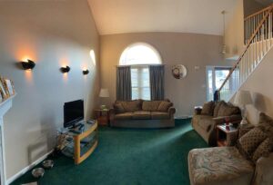
“So, what motivated you to turn to Cece for help?” I asked the homeowner. “Did you see the before pictures?” she exclaimed, admitting that decorating had taken a back seat to work and kids for the last 25 years. Not only did she want to tone down the beach theme and go in more of a Coastal direction but she also wanted to refresh her ’80s-era house top to bottom. “There wasn’t a surface in this house that wasn’t touched,” Cece says of the refresh that was carried out in phases.
First up was redefining the beach theme. While Cece’s client wanted to go completely in a Coastal direction, Cece maintained the look didn’t lend itself to landlocked Lancaster County. Instead, the two agreed to combine Coastal with the client’s second-favorite style, Modern.
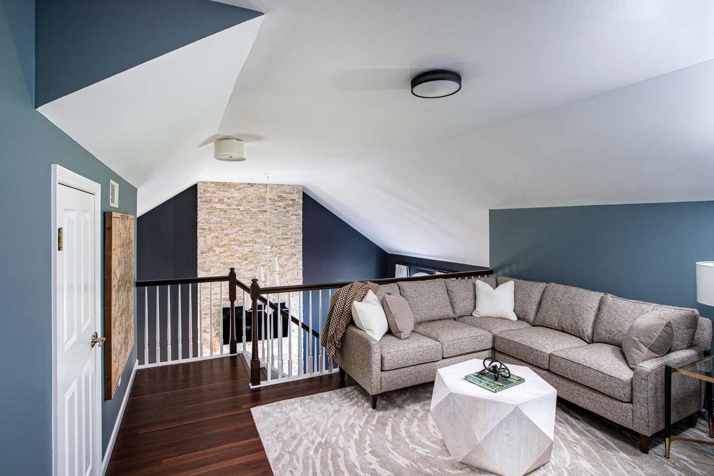
A second-floor loft was designed to provide the homeowners’ son with his own getaway and study area. The space is furnished with a sectional sofa and a coffee table whose cubic shape echoes the angles of the ceiling.
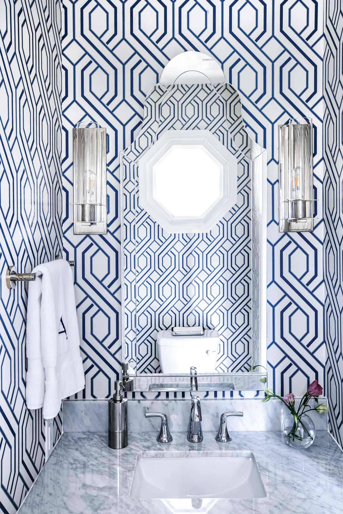
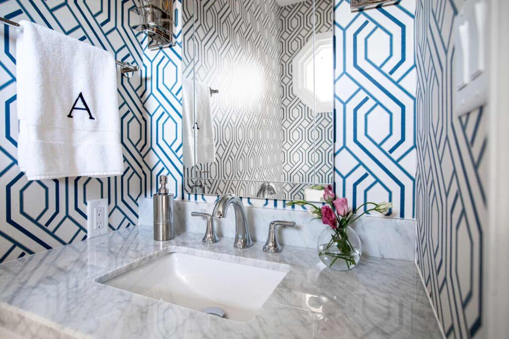
The tide definitely turned in this powder room! The blue-and-white, trellis-inspired wallpaper, marble-topped vanity and silver plumbing and lighting fixtures make the small space pop!
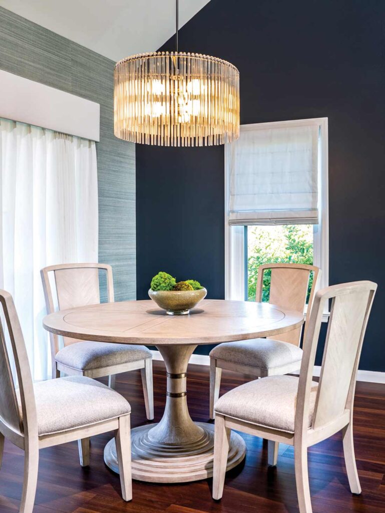
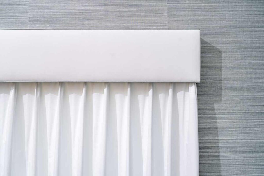
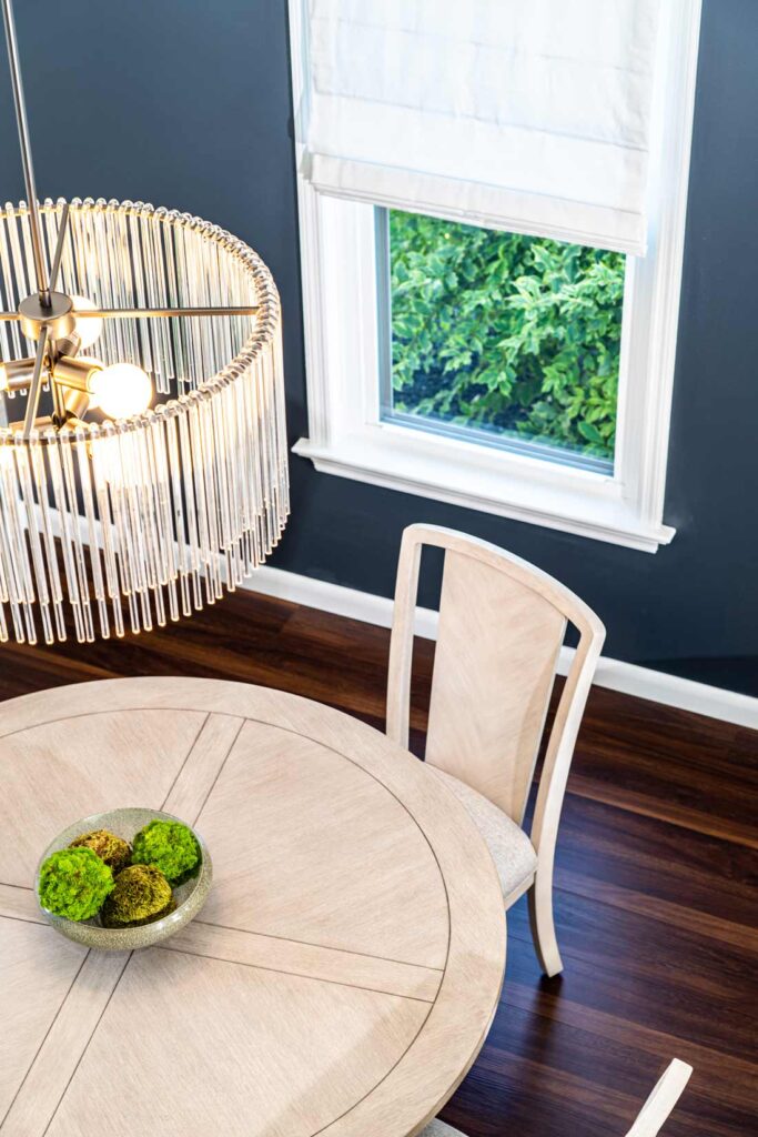
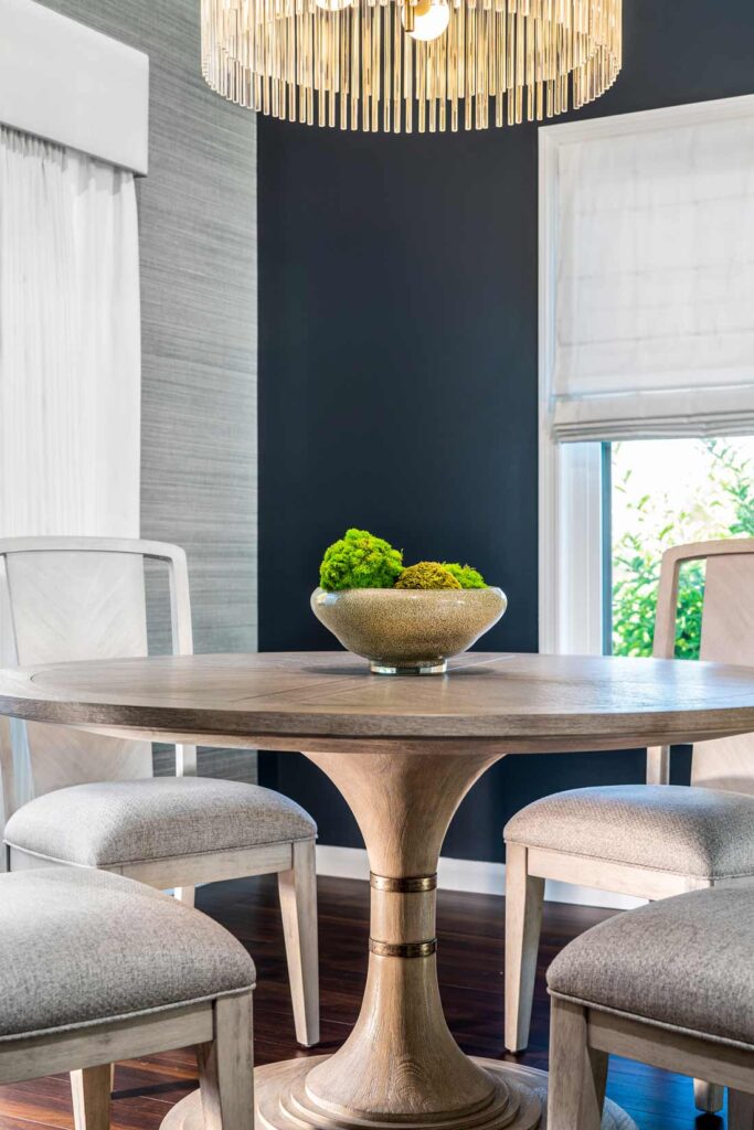
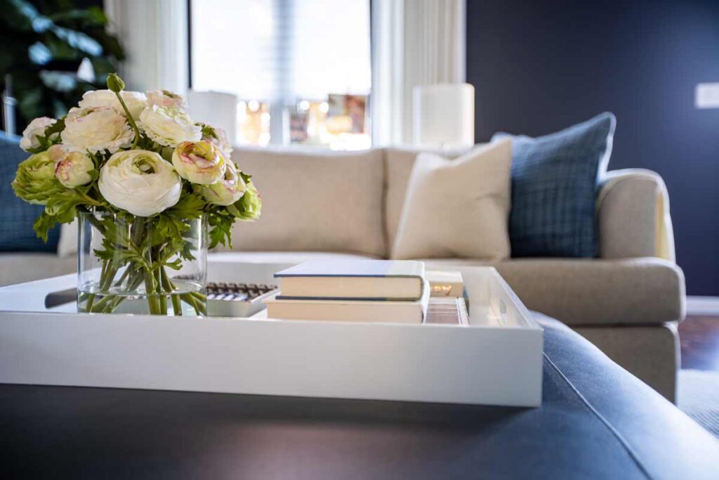
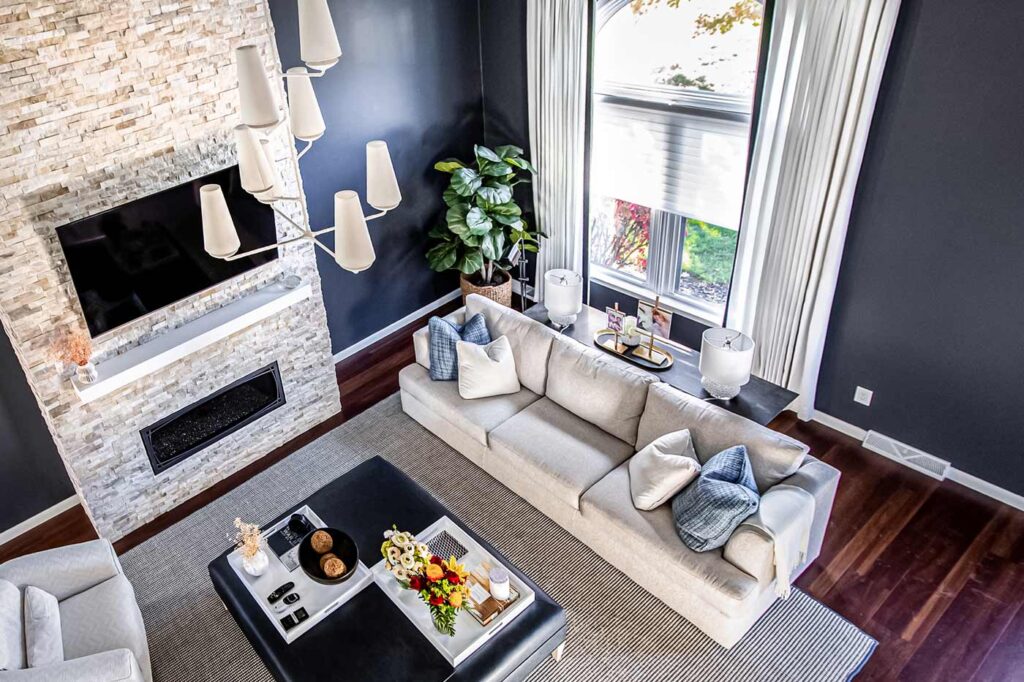
The resulting Modern-Coastal look provided the client with the best of both worlds. The color palette – hues of blue, gray, beige and white – conveys Coastal, while design elements such as the textured grasscloth (it’s made a huge comeback), a blue/beige sisal rug and lighting fixtures harken to Modern design, as do the comfortable furnishings that will hold up to wear and tear due to performance fabric, which is a huge buzzword in the industry these days.
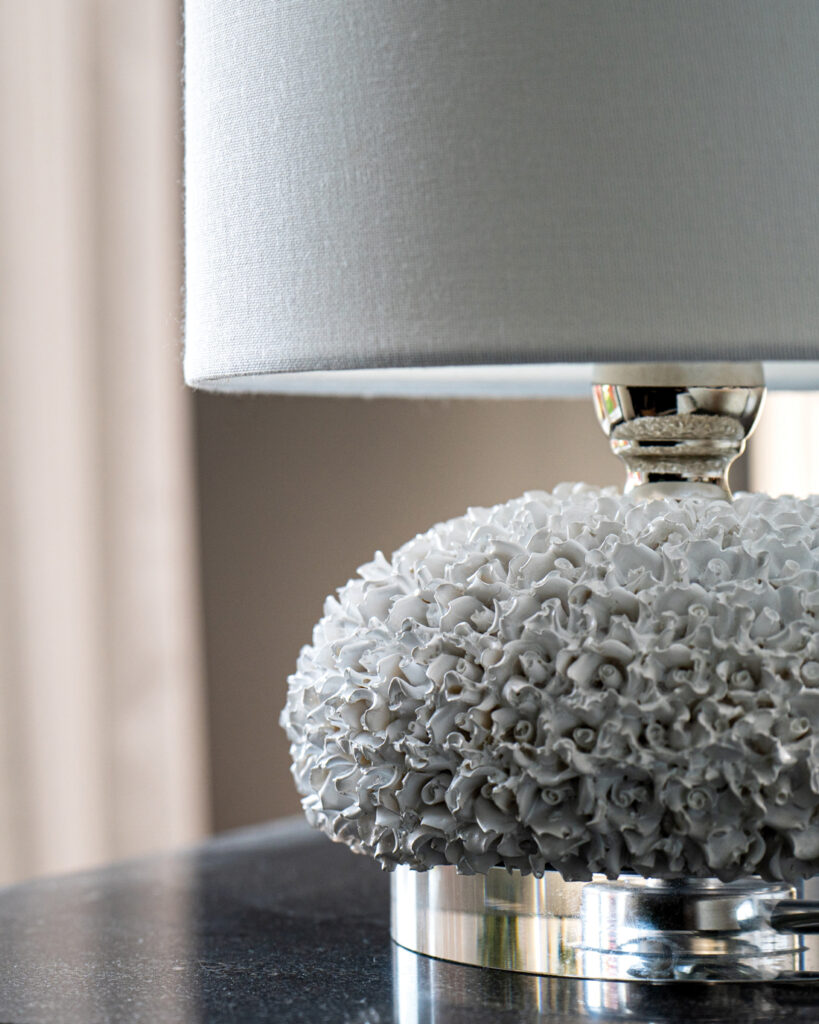
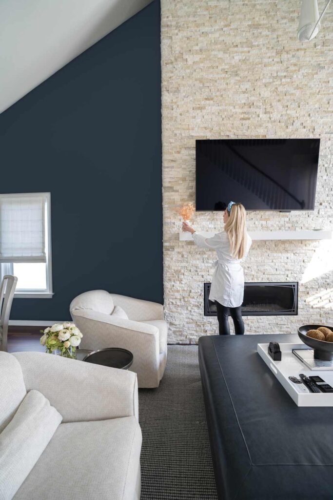
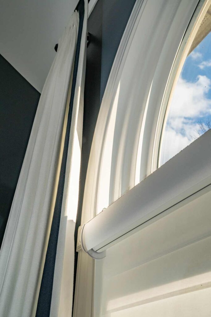
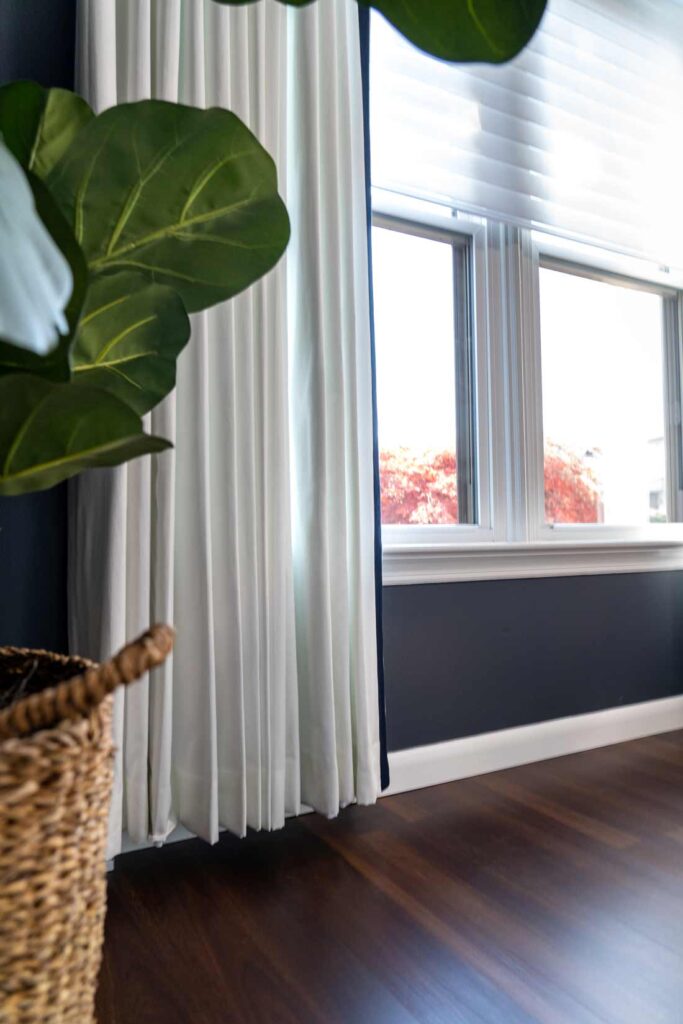
Accessories subtly allude to Coastal; for example, the lamps on the sofa table appear to be made from coral. The white, linen-like draperies that frame the window are trimmed in blue, while the shade admits or blocks light. The wow factor is supplied by the floor-to-ceiling fireplace whose textured surface glistens like, well, sand.
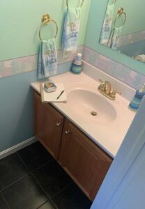
The mood continues in the dining room, where painted furniture with very modern curves stands out against the blue-hued walls. In the powder room, the beachy color scheme and wallpaper border were replaced by a blue-and-white, trellis-inspired wallpaper. In the kitchen, the Carrara marble counters mimic shifting sand. The styling continues in the primary suite, as well as the second-floor bedrooms, bath and loft area.
The results are beautiful. Despite not seeing one shell or beach-inspired throw pillow, I definitely felt the Coastal vibes, as well as the unmistakable Cece-modern touch.
• Furniture with Curves and Angles
• Multi-tasking Furniture
Credits
Blue Leather Ottoman: Vanguard
Custom Window Treatments: fabrics by Brunschwig & Fils; trims by Samuel & Sons
Dining Room Grasscloth: Phillip Jeffries
Powder Room Wallpaper: Lee Jofa
Wallpaper Installation: Bill Mineo



Amazing work, Cece!
Thank you Joyce! 🙂