Anyone who has spent the last 18 months taking refuge in their home will undoubtedly agree with one thing: You’ve either gained a new-found appreciation for your kitchen or grown to absolutely hate it.
If you’ve paid attention to news reports over that period of time, you’re no doubt aware that the latter is probably the consensus of opinion. Designers, cabinetmakers, appliance retailers and other kitchen-related trades have never been busier. It’s become obvious that many of us are in the throes of remodeling our kitchens.
What’s trending? Individuality would probably go at the top of the list! While we are all rejoicing over the fact that we can dine out again, we’ve also come to realize that staying home and spending a quiet evening puttering around the kitchen isn’t all that bad. The pandemic helped to reinforce the notion that the kitchen is and remains the heart of a home.
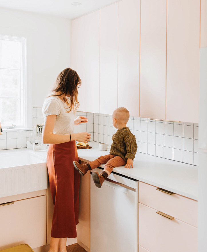
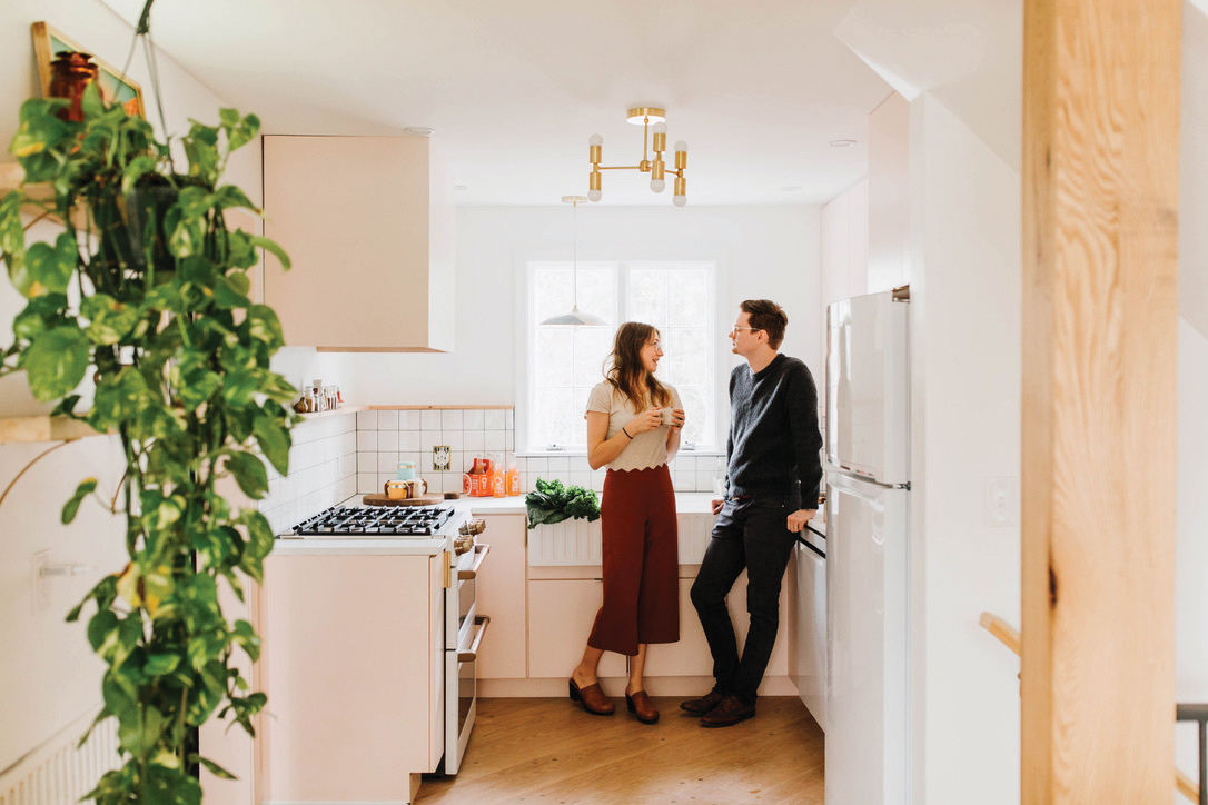
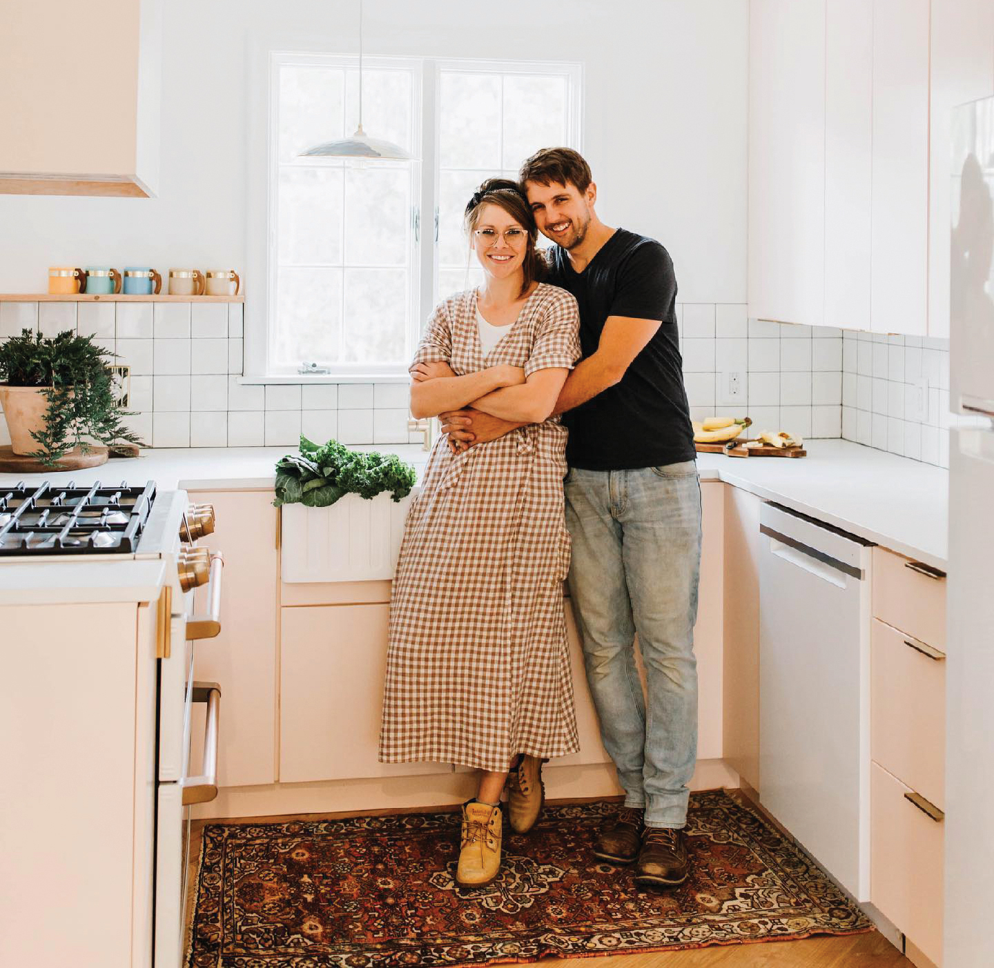
The pandemic has only reinforced the fact that no matter its size and style, the kitchen is the heart of a home. Photos by Madeline Isabella; courtesy of The Chris & Claude Co.
As a result, kitchens have become very personalized spaces that are brimming with color, interesting tile and flooring, beautiful counter surfaces, creative lighting, high-tech appliances and the list goes on.
To demonstrate how individualized and personality-driven kitchen design has become, we reached out to three companies that were happy to share some of their favorite kitchen remodeling projects with our readers.
– Suzanne Starling-Long
The Chris & Claude Co., Creative Space Designers
In the Pink!
Chris and Claudia Beiler are a husband-wife, self-taught team based in Honey Brook. “We discovered, quite by accident, that we enjoyed working together and designing unique spaces while renovating our first home together,” says Claudia. “We began helping out our friends with design – knowing absolutely nothing, but going with what our guts told us to do. We slowly built our company into what it is today: Real estate agents who can help you find your home and designers and a construction team who can create your dream home.”
THE PROJECT
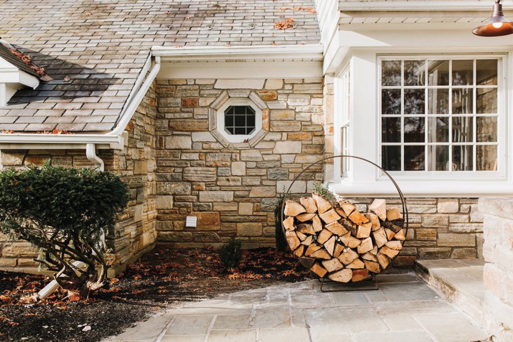
After successfully renovating and selling a row home in Lancaster City, the Beilers were excited to tackle another project. One day, Chris arrived home and announced he had found their next project, explaining it was located on the outskirts of the city and describing the stone façade as “ugly.” Chris also confessed there was no going back – he had signed on the dotted line. The house was theirs.
The two googled the address and upon looking at photos of the house, Claudia exclaimed, “No, you didn’t!”
Then came the walk-through. “The more I got a sense of the house, the more I liked it,” she recalls. Built in 1952, it still retained original elements such as hardwood floors, maroon plumbing fixtures in the bath and colorful (orange) kitchen counters. Their goal was to take “Louise” (as they dubbed the house) back to her retro roots. “Sometimes starting with what is already in place is the most creative way to begin,” Claudia wrote in a blog that detailed the process of remodeling Louise. “We call it ‘creative limitation.’” Going forward, the goal was “to keep the beautiful feel of the house and pay tribute to the era that it was built; hence, our design would reflect mid-century styling wherever possible.”
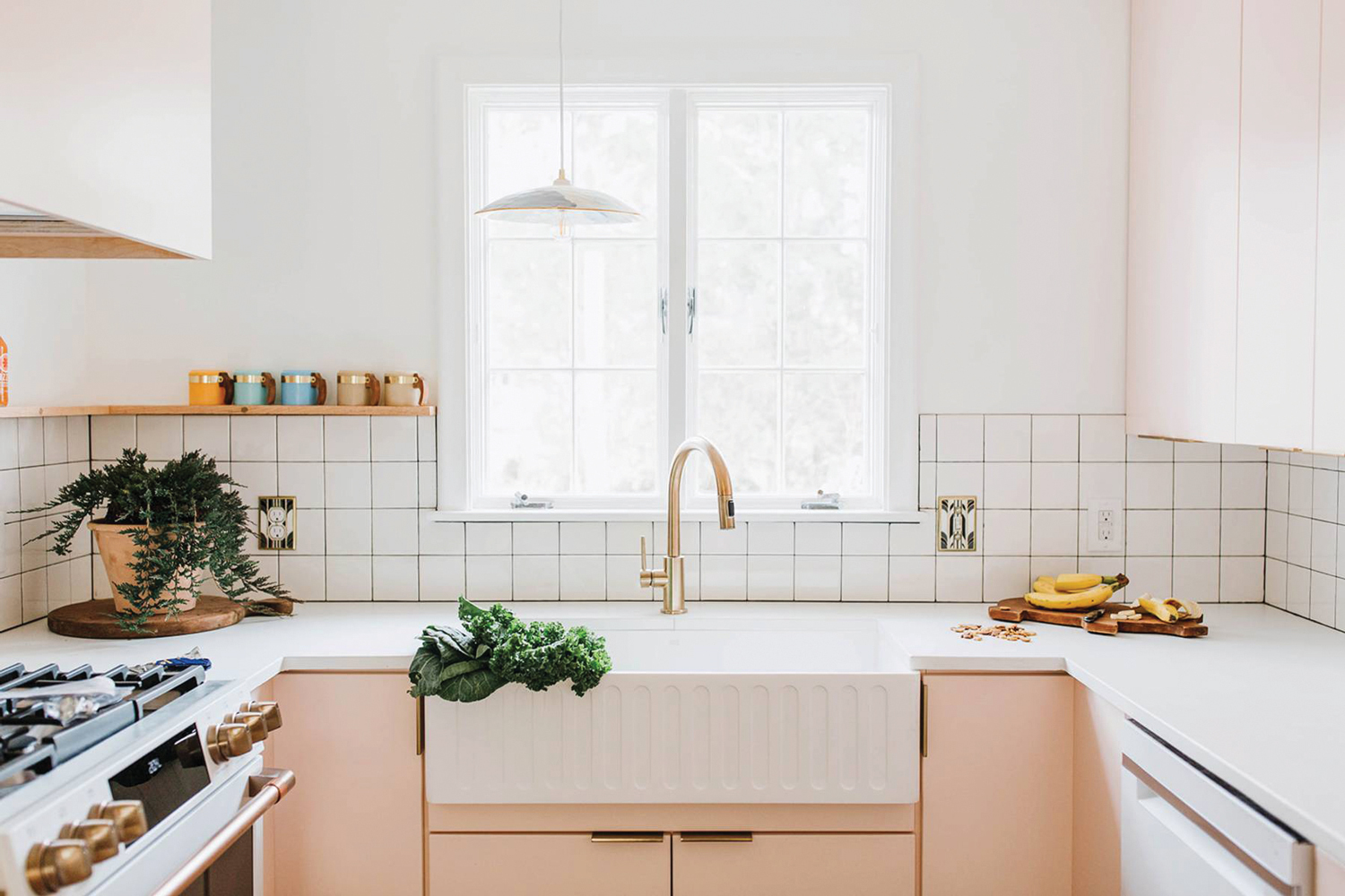
With no room to physically expand, the Beilers visually enlarged the size of the kitchen with a pink and white color scheme and simple flat-fronted cabinetry.
THE DESIGNER
Claudia Beiler
DESIGNER’S VISION
“From the moment we walked into the house, we knew that we wanted to pay tribute to the original owners and their design from the 1950s,” says Claudia, who began the process by creating a mood board that would guide them back in time. Upon discovering a vintage maroon toilet and sink in the master bath, they knew they had found the basis of their color palette. “We decided to build the entire design around that concept,” Claudia explains. Using maroon as their jumping-off point, lighter shades of pink were incorporated throughout the home.
COLOR SCHEME
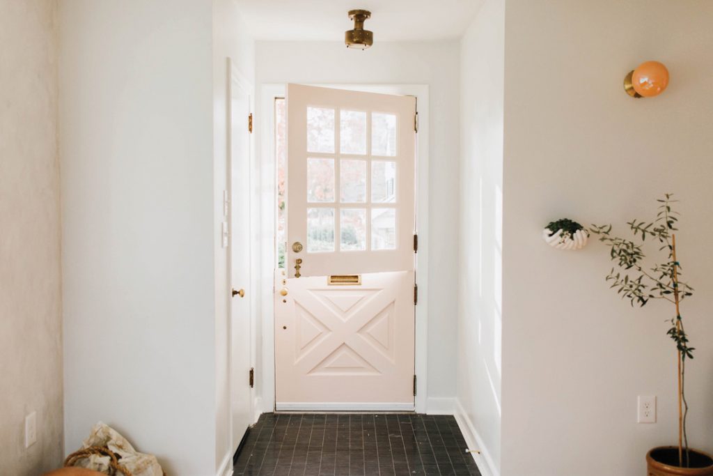
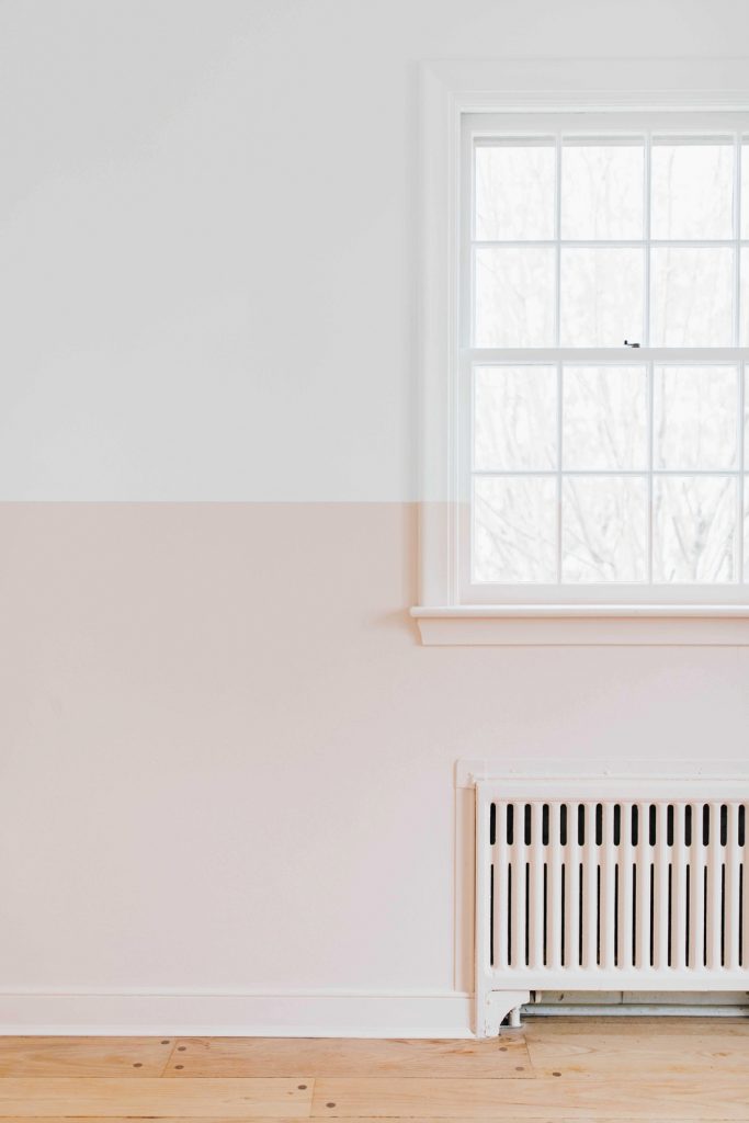
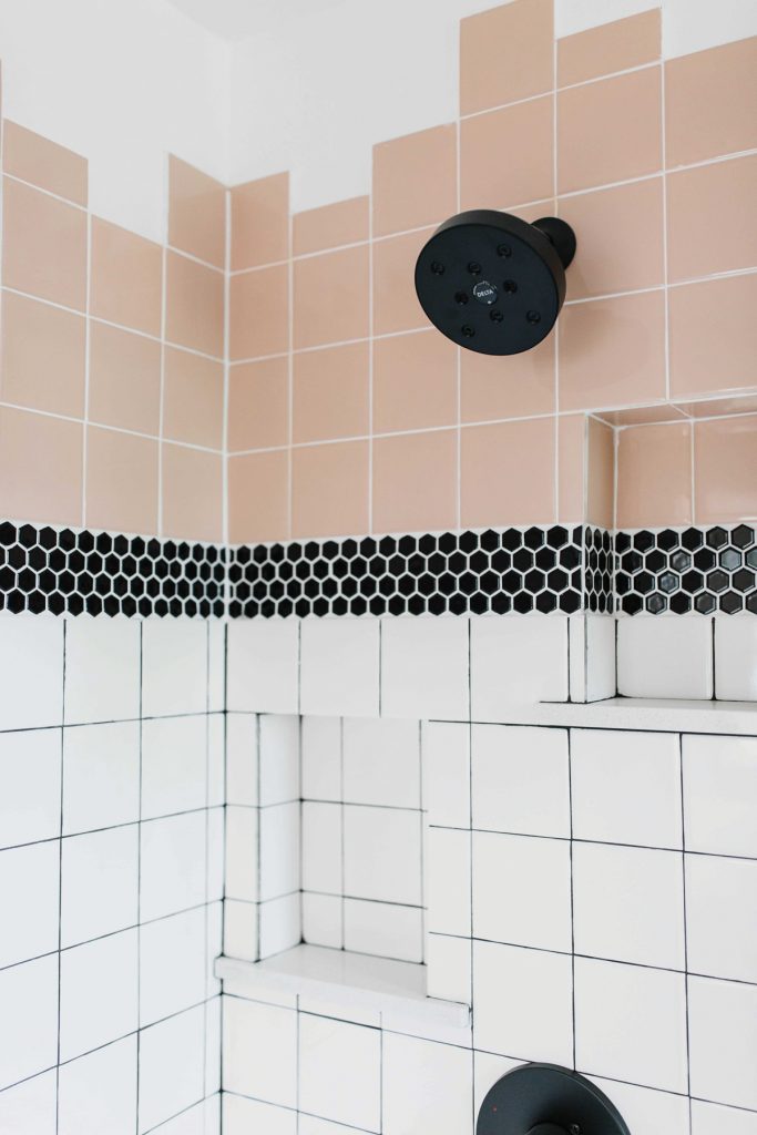
Pale pink/blush was selected to tone down the intensity of the maroon. The color is “Pink Ground” from Farrow & Ball. “It was neutral, but it still delivered an unexpected wow – especially in the kitchen!” says Claudia. Farrow & Ball describes the hue as a “dusty pink” due to a “large dose of yellow pigment” that infuses it with warmth and serenity. The company suggests pairing it with Great White, which has red undertones. Together, they work to take a pink color scheme from sugary to sophisticated.
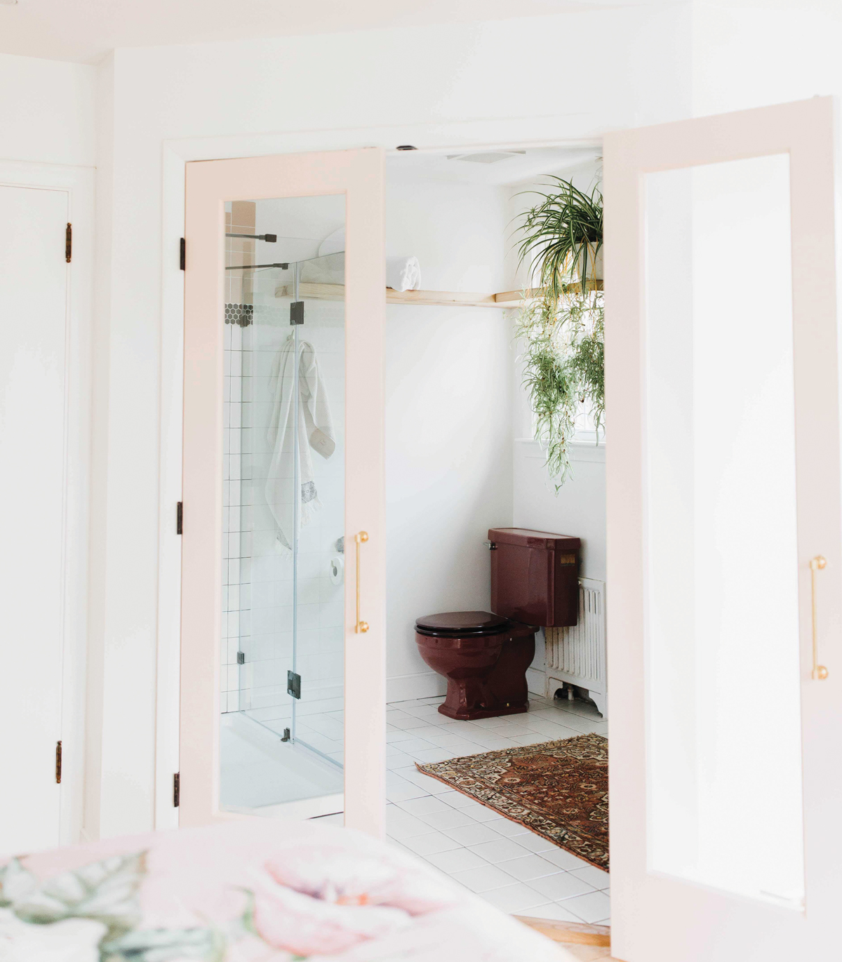
The color palette took its cue from the maroon plumbing fixtures the Beilers discovered in the bathroom.
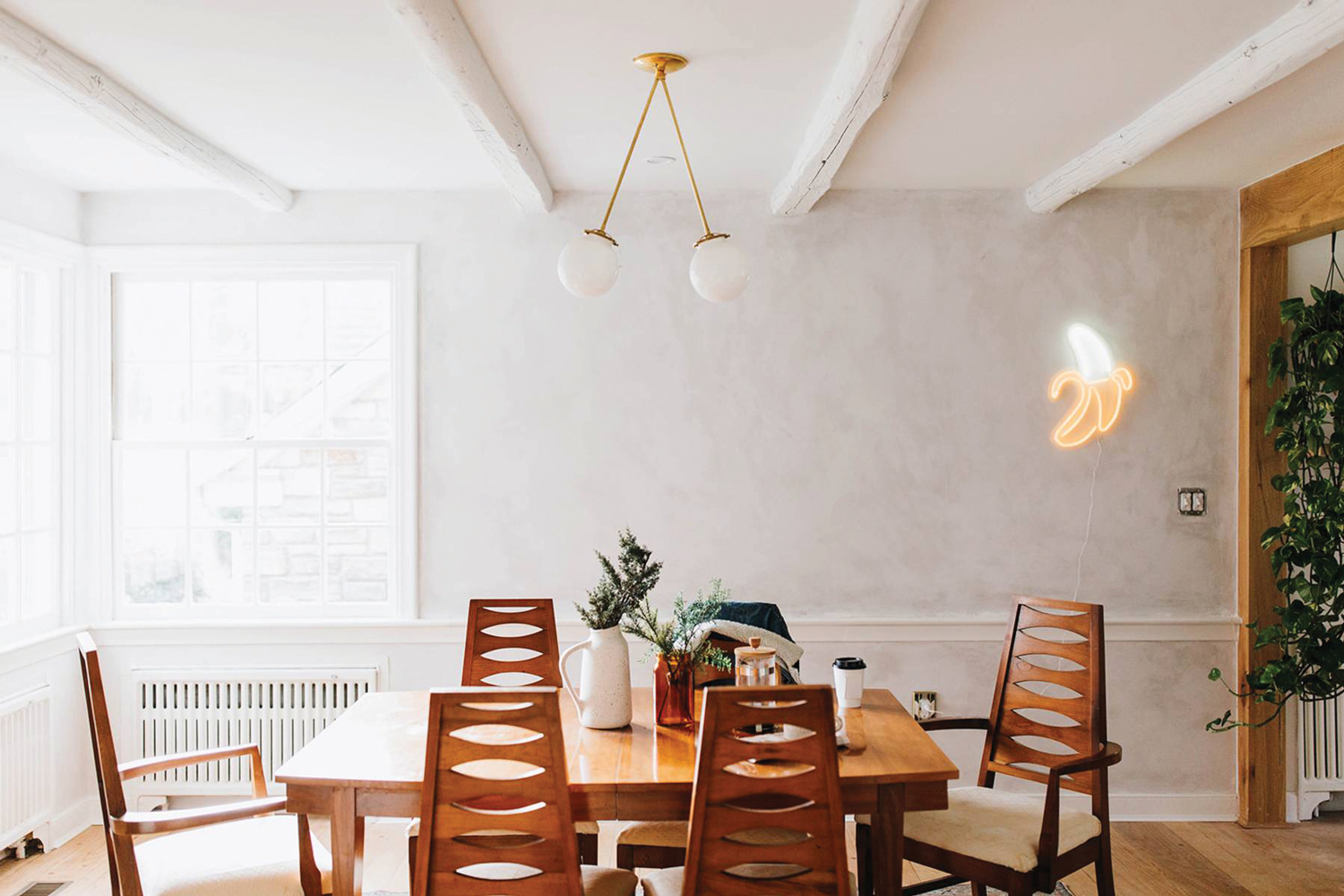
Pink Ground was ultimately used on ceilings, walls, cabinets, doors and moldings. Other shades of pink distinguished accessories, light fixtures and furnishings that were selected for staging. “We had pink-tinged limewash added into the dining room walls to add an aged and classy feel,” Claudia notes.
STYLE OF THE KITCHEN
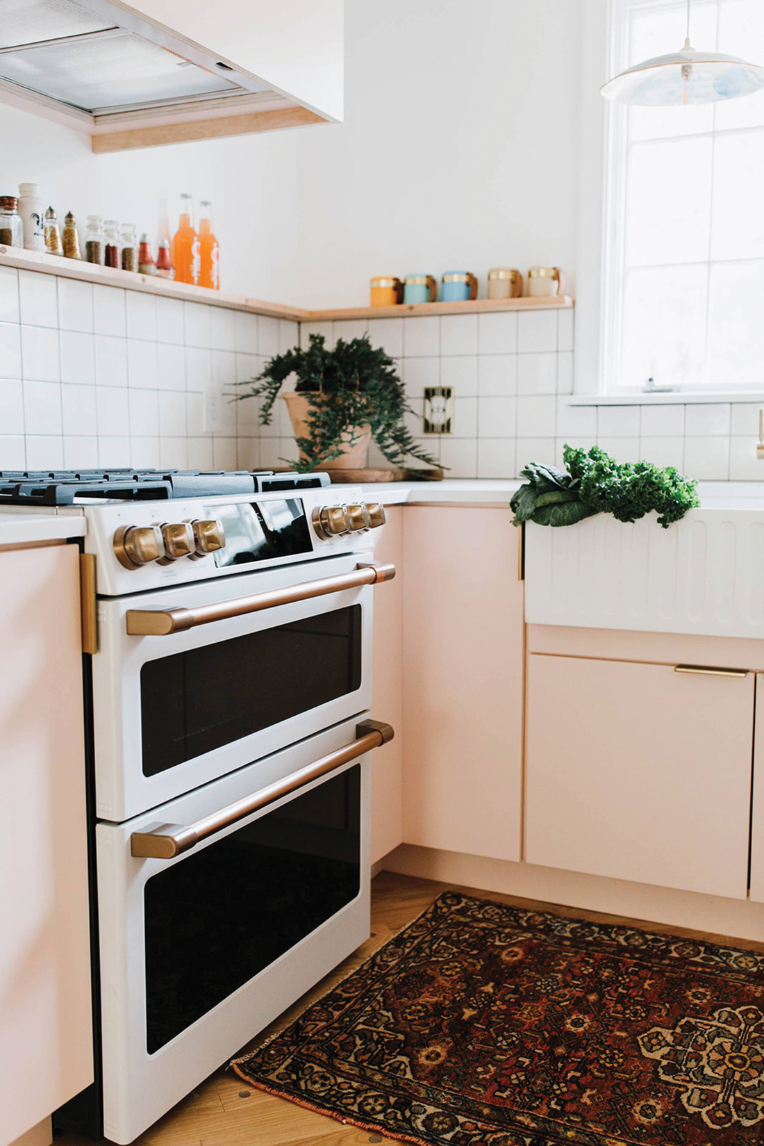
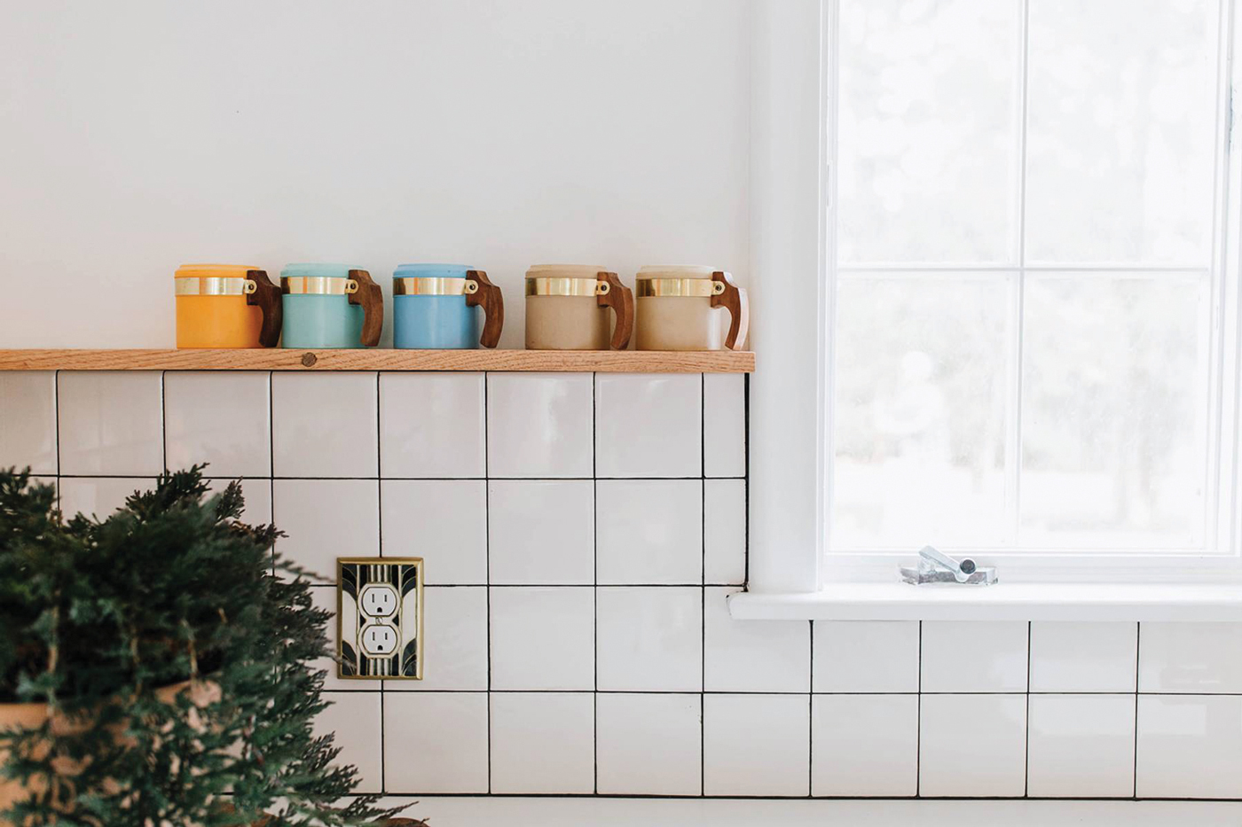
Claudia describes the results as “mid-century modern with pops of fun. We added a unique retro-era-inspired stove, a neon banana to lighten up the mood and small-scale wooden shelving that wraps around the corner.”
CHALLENGES THAT WERE ENCOUNTERED
As the house was built in the ’50s, the kitchen was far from spacious. “The space was much smaller than we wished it would be but we didn’t have any room to push out in any direction, so we worked with what we had,” Claudia says.
TRENDS THAT WERE INCORPORATED INTO THE DESIGN
According to Claudia, “We wanted to create a kitchen that wasn’t just ‘trending’ but could withstand the test of time. This meant we would incorporate pale colors, flat-front cabinets, wooden accents and beautiful concrete countertops to our design.”
Obviously, Louise and all her pinkness struck a chord with someone – when the house hit the market, it quickly sold.
CREDITS FOR PROJECT PARTNERS
The Chris & Claude Crew
Shannon King – design and limewash
Tyler Martin – concrete counters
The Beilers are associated with Kingsway Realty. To learn more about their services, visit thechrisandclaudeco.com.
Choice Home Remodeling
Inspired by Outdoor Elements
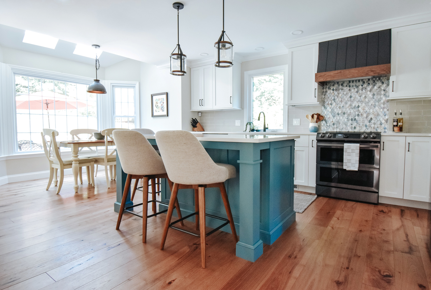
The remodeled kitchen now ties into the outdoor-living area thanks to large windows and doors, as well as to the rest of the first floor due to its open floor plan.
Choice Home Remodeling is a family-owned business with long-standing roots in the Lancaster County community. Founded in 1995, Choice has grown into the multi-faceted remodeling company that it is today, with an exterior division and an interior division that focuses on design-and-build projects such as kitchen and bathroom remodels. The mission of the company, which is based in New Holland, is to continue its tradition of excellent customer service while completing quality projects with products and workmanship it can stand behind.
THE PROJECT
This project began as a kitchen renovation. As with many of Choice’s projects, its scope expanded to flow through most of the home’s first floor.

Alyssa Hayes worked with her clients to create a kitchen that blends with the outdoors and opens to the rest of the first floor.
THE DESIGNER
Alyssa Hayes
CLIENT’S AND/OR DESIGNER’S VISION
According to Alyssa, “It was important to our client that we create a new kitchen space that incorporated both the outdoor-living areas of the home and additional living spaces within the house. The existing kitchen was very closed off; it was our intent to brighten the space by opening it up to the first floor and selecting finishes that would further the light and airy feeling brought in by new larger windows and doors that were incorporated in the renovation.”
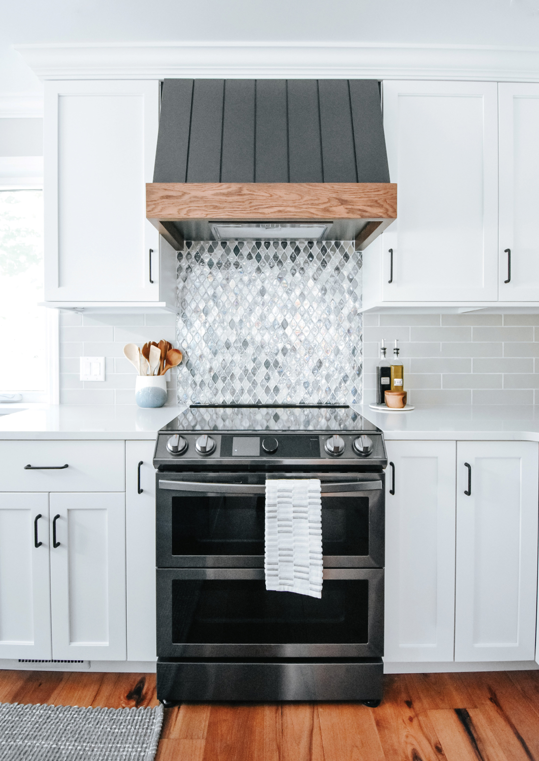
White cabinets and counters and a light-colored backsplash set the tone for a redesign that took a kitchen from being closed off to open and airy. Another much-loved color – blue – makes a style statement for the accent tile and island.
SIZE OF THE FINISHED KITCHEN
By creating a new floor plan that opened the kitchen into the living spaces, this room essentially grew in size from a very defined 11×18 area to a fluid 20×18.
COLOR SCHEME
Alyssa’s clients loved the idea of incorporating their beautiful pool and backyard area into the space via a large bay window and a new 12-foot sliding door to the patio. Bringing the outdoor elements in influenced the resulting color scheme that centers on natural-looking wood tones mixed with clean whites and a vibrant blue accent.
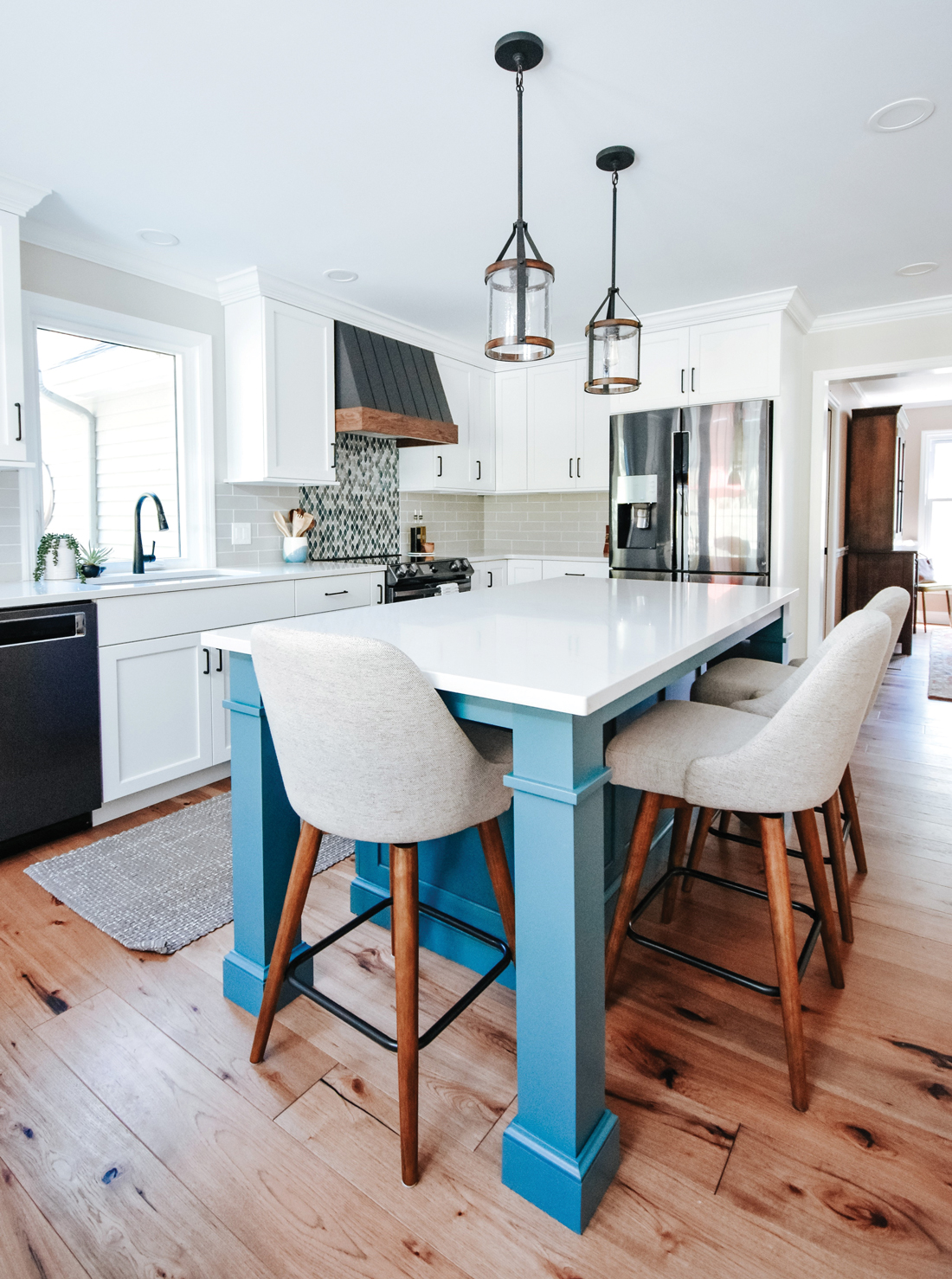
Color is one way to personalize kitchens. Here, a beautiful hue of blue defines the multi-functional island.
STYLE OF THE KITCHEN
Alyssa describes it as “an eclectic blend of warm, Pennsylvania earthy styling and mid-century modern’s clean lines and contemporary flair … among other things!”
CHALLENGES THAT WERE ENCOUNTERED
Every project comes with its own unique restraints and this project was no exception. A collaborative vision came together for an island that would serve as both a visual “hint” at a room divider between the kitchen and living room, as well as a seating and storage area. Alyssa was tasked with the challenge of creating an effective layout within set parameters. “Our client has wonderful vision and I enjoyed working together to create a final layout that we all agreed would function well while looking beautiful.”
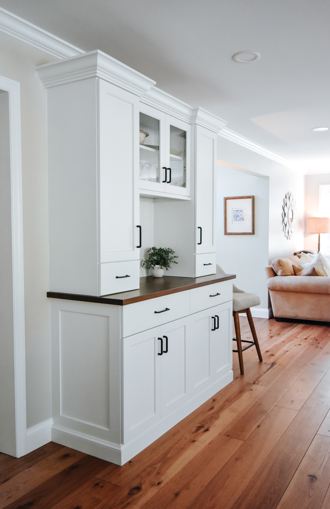
The kitchen remodel expanded into other areas of the first floor as is exemplified by this multi-functional dry bar/buffet.
TRENDS THAT WERE INCORPORATED INTO THE DESIGN
“Our client has amazing eclectic taste, which made it so easy and enjoyable to incorporate plenty of trends without being overly ‘on-the-nose’ with any one style in particular,” Alyssa explains. “While white cabinetry is a large component of this kitchen – a long-standing trend that we’re not anticipating going anywhere anytime soon – fun colors are definitely having a moment and we had the perfect opportunity to utilize a popular choice: blue. We selected a custom shade of blue for the island to keep it feeling fresh and to tie-in seamlessly with the exterior components of the home we wanted to call attention to.”
550 East Main Street, New Holland
717-354-2003 • Choicehomeremodeling.com
KbE Design & Build
Cooking Up Memories
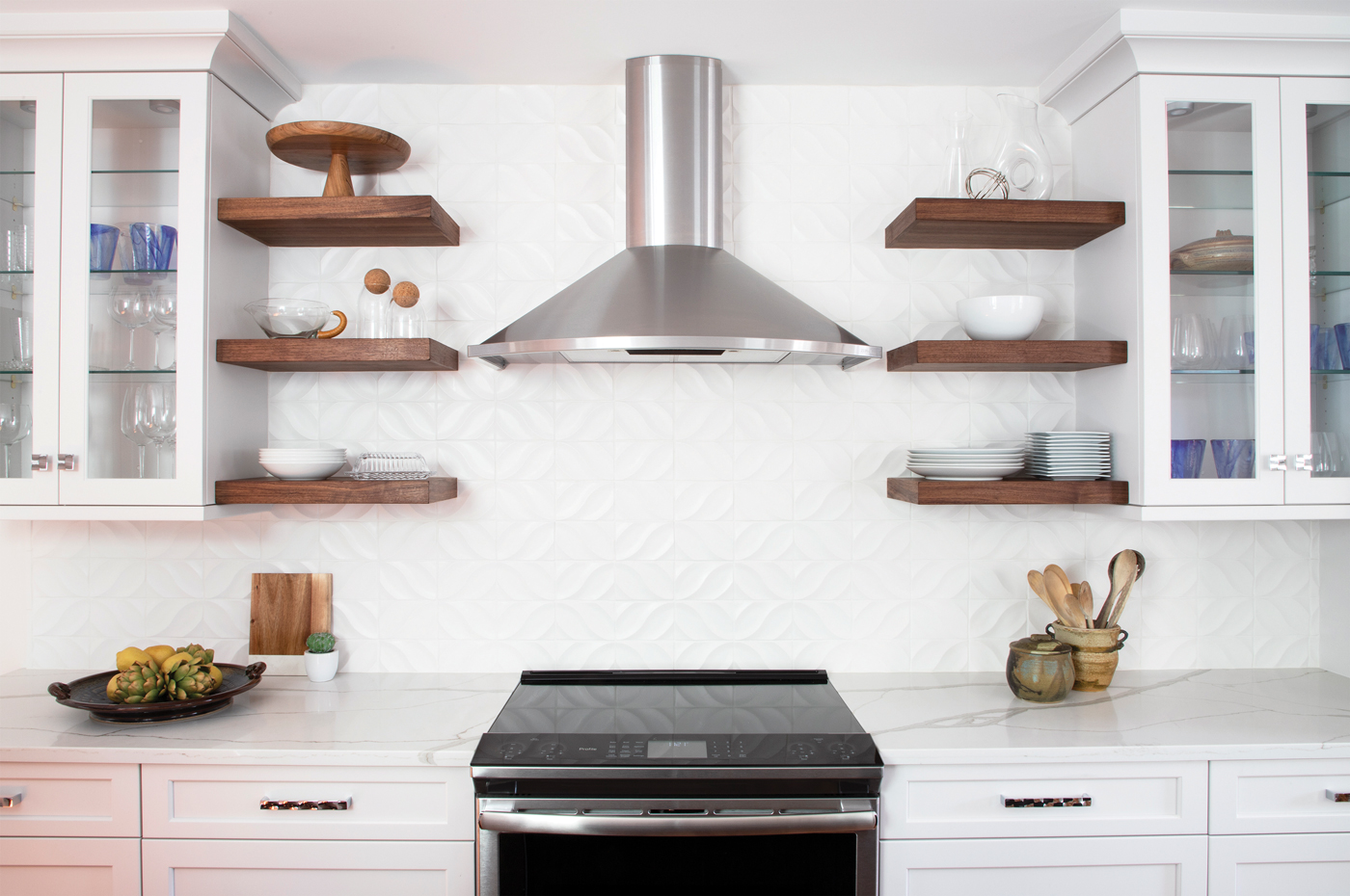
Displaying cherished kitchenware items she has collected was important to the homeowner. Designer Amanda MacFeat solved that by incorporating glass-fronted cabinets and floating shelves into the design.
KbE Design & Build, which is based in Lititz, has over 25 years of design experience. Each renovation project is carefully handled by their award-winning designers, who specialize in space planning and design. They guide their clients through the design process to help build upon their specific tastes and styles. KbE’s team sees the project all the way through to completion, giving the client peace of mind from start to finish.
THE PROJECT
When homeowner Lilia approached KbE designer, Amanda MacFeat, with the idea of remodeling her kitchen, it was a continuation of the relationship they had formed while working on the master bath and second-floor renovations of Lilia and her husband’s row home in Lancaster City. Because it is where the couple raised their three children, their home holds many memories. New memories are also being created – Lilia loves having her grandchildren visit, with painting being a favorite pastime.
Lilia, who loves to cook and bake, had been dreaming of remodeling her kitchen for years. The existing kitchen was a cramped 107 square feet. Located at the back of the house, it essentially was cut-off from the other parts of the home. The cabinets were falling apart and counter space was limited, which made cooking and baking more and more of a challenge. Finally, the time had come to turn Lilia’s dreams of a new kitchen into reality!
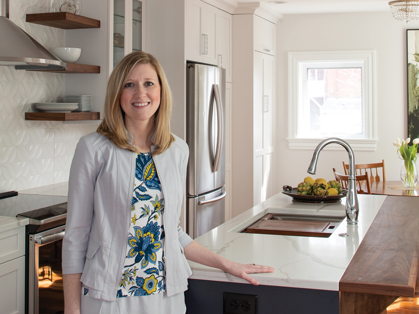
This was Amanda’s second opportunity to work with the homeowners, as she helped them renovate the second floor of their home.
THE DESIGNER
Amanda MacFeat
CLIENT’S AND/OR DESIGNER’S VISION
Amanda took the lead from Lilia’s vision for the space. The plan included removing the wall between the existing kitchen and dining space, which would more than double the kitchen’s size (225 square feet). This allowed for more storage and counter space, a better entertaining area and most importantly, a beautiful space to create more family memories.
While much of the new space would be centered around functionality, style certainly would not take a backseat. Lilia mentioned many times throughout the process that part of the challenge of living in a smaller city home is that every space needs to be multifunctional and purposefully planned. Amanda would address those concerns through the deep drawers that were planned for much of the base cabinetry and by adding interior accessories for storing dishes, utensils, cutlery and other kitchen items. The coffee station was designed with cabinet doors that pocket so that they can be left open without interrupting the traffic flow.
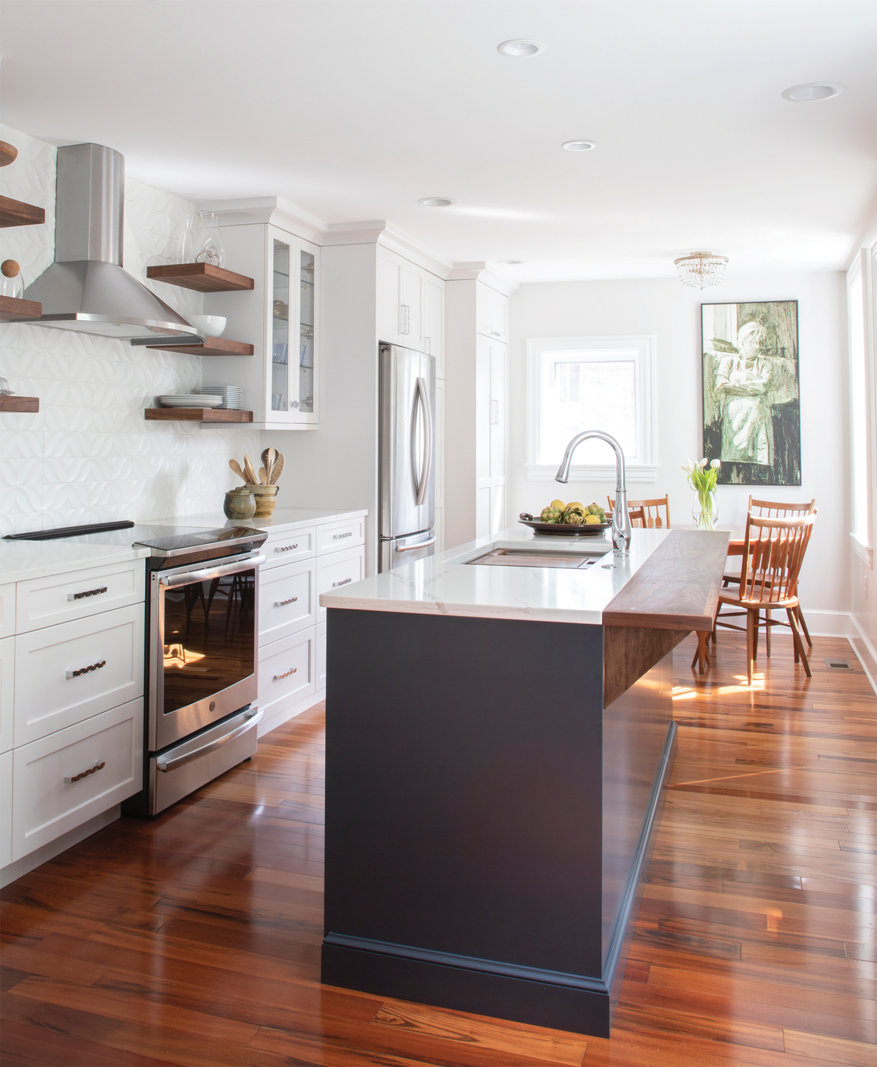
The owner of a row home in the city found cooking in her small and outdated kitchen becoming more and more of a challenge. Her dream-come-true kitchen has doubled in size and is now very user-friendly.
Another functional – but stylish – element is the flip-up walnut bar top at the back of the island. Amanda and KbE’s project manager worked with Joel Bare Woodworking to engineer this unique feature that allows Lilia’s grandchildren to pull up stools and bake or simply visit with her. When not in use, it can be lowered, making it easier to move throughout the space on a daily basis.
Lilia also wanted to take aging-in-place into consideration. For example, the laundry area is located in the basement and Lilia wanted to plan ahead and include a way in which a stackable washer/dryer unit could be moved to the kitchen in the future, thus eliminating the need to go up and down the basement steps. To achieve this, Amanda designed a tall cabinet to the right of the refrigerator that blends with the rest of the kitchen cabinets. In the future, it can accommodate a stackable washer/dryer.
STYLE OF THE KITCHEN
According to Amanda, “The aesthetic of the kitchen was focused around marrying a simple, modern design with the warmth of wood tones and textures that would create a classic look to withstand the test of time.”
Lilia’s great appreciation for art and the sentiments relating to her kitchenware collection also played a role in the design of the kitchen. “Many are items of sentimental value that she has collected over the years,” Amanda notes, adding that Lilia shared many stories with her about where the pieces came from or who made them. Hearing the stories prompted Amanda to include glass-front cabinet doors and beautiful walnut floating shelves – also made by Joel Bare Woodworking – as the perfect solution for displaying Lilia’s collection.
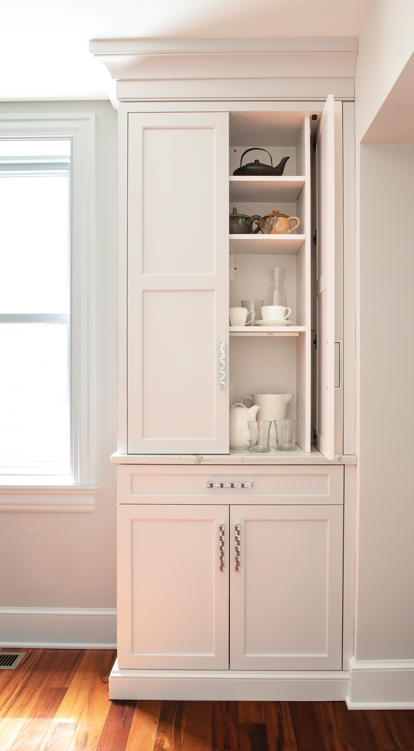
Being cognizant of space constraints and traffic flow, Amanda designed a coffee station with pocket doors. Note the art-influenced drawer/door pulls that tie into the stainless appliances and floating walnut shelves.
COLOR SCHEME
The cabinetry, from Signature Custom Cabinetry, features custom colors that were selected with the intent of pulling the quartz countertop and backsplash together.
CHALLENGES THAT WERE ENCOUNTERED
Other challenges involved relocating the entrance to the existing powder room, replacing the existing exterior side entrance, concealing the waste line from the previous second-floor bath remodel and tying into the existing Brazilian cherry wood floors.
As for the powder-room entrance, Amanda uses the word “awkward” to describe the fact that it would now be in the kitchen. The solution was to relocate it to the top of the landing at the basement steps. This also created the perfect wall space for a television. The issue of the side door was solved by replacing it with a taller single door that allows more light to flood into the space and provides a more updated clean look. The waste-line problem was remedied by hiding it behind cabinetry and crown molding. The last challenge was tying into the existing wood floors; fortunately, Lilia was able to source the material from the vendor that supplied the existing material.
29 South Broad Street, Lititz
717-627-1690 • Kbebuild.com



SHARE
PRINT