“Styles and lifestyles change,” says kitchen designer Amber Miller of Bareville Kitchens & Design. When those changes happen simultaneously, homeowners are faced with the age-old question of whether to remodel or move. That dilemma presented itself to a couple who had already undertaken two major remodeling projects over the course of nearly 30 years. Now, as empty nesters, they were questioning whether their home’s style and their lifestyle were in sync.
 They built their much-loved home as newlyweds. The arrival of three children created a family, which prompted the first remodeling project that saw the basement become an entertainment center, complete with a full kitchen, theater, billiard room and more.
Ten years later, one of their fathers became ill, which motivated the couple to tackle their next project: an addition that was dedicated to an in-law’s suite. The addition also held a new garage.
The project also inspired them to solve other lifestyle issues: the small family room, which adjoined the kitchen, became an informal dining area, while the adjacent master suite was transformed into a much-larger family room. The footprint of the original garage was enlarged to accommodate a laundry and powder room on the first floor and a master suite on the second floor.
 By 2015, the couple – now empty nesters – were at a crossroads and asked themselves whether they should stay put or move and downsize? Despite going through the motions of looking at potential new homes, they knew theirs could be perfect for this new phase of life that included welcoming new members to the family (through weddings) and entertaining their empty-nester friends. They agreed that remodeling, and not moving (or downsizing), was on their agenda.
For the third round of remodeling, the kitchen would be the area of focus, so they called on their original designer, Fred Miller of Bareville Kitchens & Design, for help. In 1990, their kitchen was very much on-trend, as it included pickled white cabinetry (which Fred admits didn’t stay in style for long) and Corian counters. Now, the kitchen looked tired. In fact, the entire first floor was looking dated.
Fred and co-designer Amber Miller met with the couple to not only gauge their wish list for the new kitchen, but to also learn what they didn’t like about the current kitchen. The wish list boiled down to one point: they wanted to start anew, with the word “classic” being their vision for the space. And, space was the major concern – there wasn’t enough of it. “This was going to be a major undertaking,” Fred notes. “But, because we were being given relatively free reign, I knew it was going to be a fun job.”
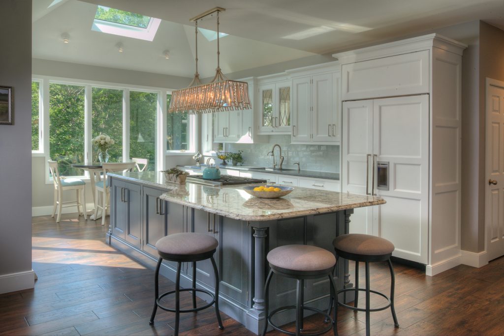
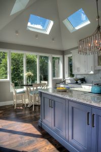 At the top of the must-have list was a large island – one that was big enough for 20 people or more to gather around for entertaining purposes. And, it needed to include a cooktop stove that had a view of the dining area so that the cooking-loving husband could stay connected to family and friends while he worked. The island also had to provide ample storage and pullout drawers that would keep cooking and baking essentials organized.
Light was also an issue. A lone window, three skylights and a patio door kept one end of the kitchen bathed in natural light, while the other end was in relative darkness. They hoped to achieve a better balance of both natural and provided light. “The backyard view begged for a wall of windows,” Amber remarks.
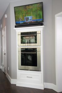
The new design called for the kitchen to expand beyond the confines of the original – a baking center composed of double ovens fit perfectly into a diagonal wall, while a furniture-look wet bar is located in the informal dining room but is convenient to the entire first floor.
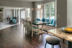
 In order to create more of an open floor plan for the first floor, walls were reworked and rooms were rearranged. For example, a pantry took over space that had held the powder room, which was relocated to the other side of the hall. The music and dining rooms traded places. (The new music room lost 3 feet of space in order to create the new powder room.) A window seat in the informal dining room created storage and seating for the dining table.
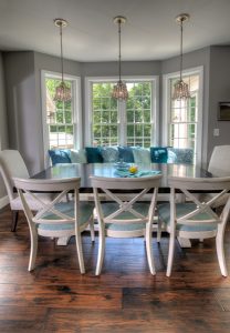 As with the second project, the couple utilized the opportunity to correct issues that had arisen over time. Bareville’s Phil Lehman, who served as the construction coordinator, handled that aspect of the project. “We replaced window sashes, solved some subfloor issues and took care of structural repairs that were needed because of rot that resulted from problems with the dryvit,” he says. He also oversaw the installation of a new main staircase. Specialty molding was also his area of responsibility. “As with any remodeling project, problems can and will occur,” he says. “Fortunately for us, the clients wanted them taken care of and done right.”
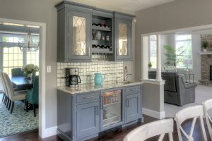 Style was also important to the couple. Classic was the word to design by. Keys to achieving the specified look included hardwood floors, white cabinets, gray for the island and wet bar, brushed nickel finishes, mirror accents, glass subway tile, granite counters and wood-panel-covered appliances.
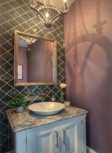 Achieving a specified look is, of course, dependent upon decision-making, and to help the couple with that element of the project, Bareville suggested that an interior designer be brought aboard. Bareville recommended Janine Arnesen-Nolt, who heads Arnesen-Nolt Interiors. “They had to make a lot of decisions, which can be overwhelming,” she explains. “My role was to guide them and take the pressure off.”
In Janine’s opinion, achieving a successful outcome hinges on communication, and thanks to the constant ebb and flow among her, the designers from Bareville and the clients, she maintains that their goals were met. “Yes, they wanted clean and classic, but at this stage of their lives, they also wanted to add a sense of elegance to their home,” she explains. That was achieved with lighting upgrades, high-end finishes, unique moldings and faux finishes.
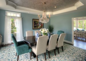
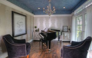 A color story was also important to the homeowners. They were more than ready to embrace color and chose to incorporate transitional grays, vivid blues and a dramatic plum into the palette. “It took a lot of finessing – everything had to look good both separately and together,” Janine explains. She elaborates by saying, “Design-wise, everything has to have a conversation.”
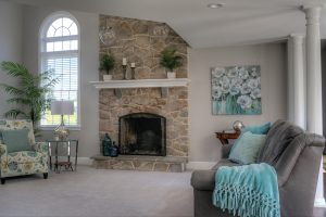 In Janine’s estimation, one of the responsibilities of an interior designer is to provide clients with creative suggestions that can make all the difference in a project. But, in order to bring those suggestions to life, teamwork is essential. “You have to have a team to carry out the vision, and, here, Bareville was that team,” she says.
Together, they had to plan a stepped window in the kitchen that would allow room for the cabinetry to meet the wall but maintain the view. Lighting is always a critical feature of interior design projects and here, directional mono-point lights were chosen over recessed lighting in the angled ceiling of the breakfast area. “That way, light could be pinpointed to specific areas as needed,” she explains.
“It was wonderful to work with clients who had a vision but trusted mine,” she says of the results.
Trending … Bareville Kitchens & Design
Until nine years ago, Bareville was known for its furniture selection and the model kitchens – created by sister company Quality Custom Cabinetry – that greeted visitors at the front of the store. Today, Bareville is devoid of furniture. Instead, it has transitioned into an all-encompassing design center for projects such as kitchens, bathrooms and other spaces in the home that require cabinetry, flooring, tile, molding and window treatments for both new construction and remodeling.
According to designer Fred Miller, who has been in the business for 35 years, “Trends are changing faster” and people come into projects “very educated.” He attributes both to the world of cyber space. Because of the Internet, homeowners can keep abreast of the newest trends, whether it’s in their own backyard or on the other side of the world.
What’s on trend in Lancaster? According to Fred and Amber, Lancastrians are liking:
- Traditional/Transitional Cabinetry
- White Cabinetry
- Cabinetry with Glass Accents
- White Backsplashes
- Subway Tile
- Glass Tile
- Patterned Tile
- Oversized Tile for Flooring and Shower Walls
- Brushed Metals (Gold, Nickel and Brass)
For more information, visit barevillekitchens.com.
Trending … Janine Arnesen-Nolt
Janine shares that she’s been interested in interior design since she was a child, who constantly rearranged the furnishings in her bedroom. “I always knew this is what I wanted to do,” she says. After graduating from Garden Spot High School, she earned her BFA from the Maryland Institute, College of Art. Her career took her to Baltimore, Philadelphia, Chicago, New Hampshire and back to Lancaster in 2006. She founded Arnesen-Nolt Interiors four years later and specializes in both residential and commercial projects.
What are Lancastrians liking? According to Janine it’s:
- Classic White Trim
- Contrasting Colors
- Bursts of Color
- Bold-patterned Fabrics
- Faux Finishes, Especially Metallics
- A “Family” of Grays
For more information, visit lancasterinteriors.com.


Leave a Reply