Lancaster may be the epicenter of colonial and traditional styling where kitchen design is concerned, but if this kitchen is any indication, we have our fair share of modernists among us.
 David White, whose company, Kitchen Encounters, designed and executed this kitchen, readily admits that modern is a style that has “rarely” been requested among the clients he has worked with over the last 11 years. “It’s not typical for us, or for Lancaster, that’s for sure,” he reports. “We like what we like in Lancaster, and that’s basically traditional.”
Still, David and his team were excited to be given the opportunity to work on a project that would essentially be outside the box from a style perspective. “Most people have an idea of the style they want, but need a little help to get the look they are after,” he explains. “However, Jackie and Ray, our clients for this project, knew exactly what they wanted.”
The project would also present the team with some first-time “encounters,” including the waterfall island and touch-latch cabinetry. The shades of gray color scheme also represented a deviation from the norm. “White Shaker cabinets still dominate in Lancaster County,” David notes. “But, I think people are increasingly embracing gray – I think they’re more apt to use it instead of beige.”
Jackie and Ray had made the decision to downsize and purchased a house that would allow them to fully convey their love of modern styling via a whole-house remodeling project. The kitchen in their previous house was traditional in style, and as Jackie explains, “We liked it, but it just wasn’t us.”
When the couple asked family and friends for recommendations for a kitchen designer, a friend of their daughter’s suggested Kitchen Encounters. At their initial meeting, the couple explained their vision and shared they enjoy being involved in the selection process. “We have the same taste and work really well together,” Jackie says of her and Ray’s fondness for perusing magazines and the Internet for products and ideas. “I watch a lot of HGTV, and the first time I saw a waterfall island, I knew I wanted one,” she adds.
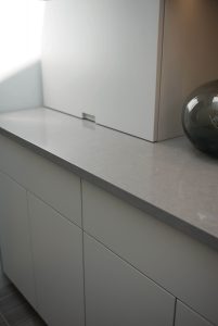 The gray color scheme is a carryover from their previous home. “We remodeled our master bath and went with a gray color scheme and loved it,” she continues. “So, we decided to use gray as the color basis for our new kitchen.”
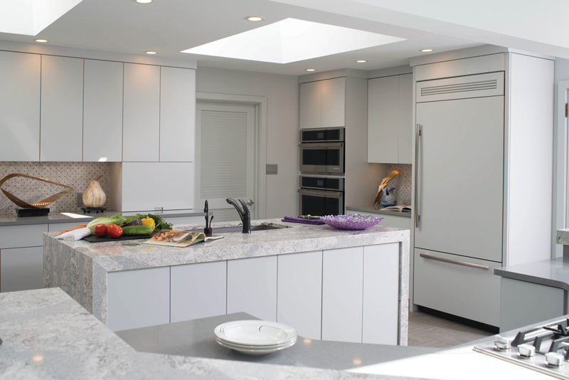
 With the style established, designing a multi-functional space was next on the agenda. Jackie loves to cook, and both she and Ray enjoy entertaining. A window-filled addition had created space for casual dining and seating areas, but the area between them essentially resulted in dead space. David suggested that they put it to better use and expand the footprint of the kitchen into it. “By doing so, we were able to provide the kitchen with two islands,” he explains.
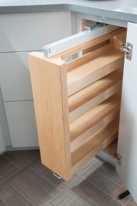
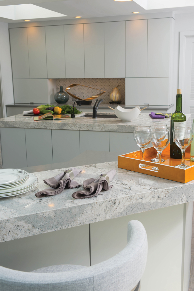
The larger, multi-tiered island does double duty as a breakfast bar and cooking space. Drawers and cabinets are designed to stay organized with special pull-outs that accommodate utensils, spices, baking sheets, etc. The smaller waterfall island provides prep space thanks to an inset sink; it also allows for easy cleanup, courtesy of a dishwasher and pull-out trash receptacles. It also does duty as a staging area for the adjacent formal dining room. A wall that holds the paneled refrigerator and stacked ovens is easily accessible from both islands.
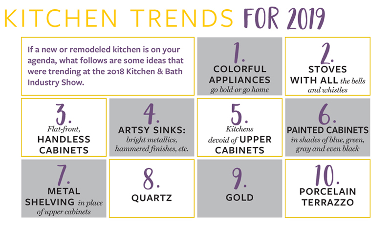
 The touch-latch cabinetry is very much on trend and was highly visible at January’s Kitchen & Bath Industry Show (KBIS) that was held in Orlando. Some refer to the style as handless cabinetry, since it allows you to merely bump a cabinet or drawer and it automatically opens. They close just as easily. “All the cabinets in this kitchen are custom,” David points out. “The style gives you a really clean, minimalist look, especially since hardware isn’t involved.”
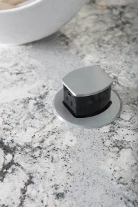
 No kitchen is complete without the finishing touches. The islands literally sparkle, thanks to the quartz countertops that distinguish them. “We had to use specially engineered brackets to hold the weight of the quartz,” David notes. Quartz counters also top the lower cabinets but deliver a more matte look. Wall niches are highlighted by tile in a basket-weave pattern. The porcelain tile floor also reflects the basket-weave effect. Ray specified its layout. “The offset way in which it was laid delivers more of a random pattern,” Jackie explains.
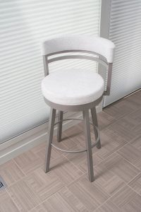
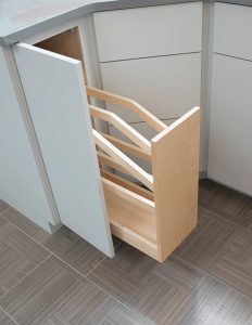 Other design elements include pendant lighting over the main island and top-down/bottom-up shades on the oversized windows that admit filtered light or allow for a view of the gardens. Modern stools provide comfortable seating at the breakfast bar. All, of course, tie into the gray color scheme. “Between the style and the color, you have a very modern kitchen,” David remarks.
As for Jackie and Ray, they enjoyed the collaborative effort. “They were in touch with us every day,” Jackie says of the Kitchen Encounters team. “They explained everything explicitly. I feel we made some new friends.”
Credits
Design/Installation: Kitchen Encounters
Appliances: Martin Appliance


I love that Lancaster County clients enjoy contemporary styles, as well as traditional. Great job!